You know that listing. The one that keeps showing up no matter what you search. You type in "cottagecore wall art" and there it is. You try "spring prints." There it is again. "Cozy neutral decor." Same listing. A watercolor sparrow on a flowering branch, soft neutral palette, sitting in what looks like a beautifully styled living room. It feels like it's been on Etsy forever.
The shop is called ArchiveArtCo. It opened in late January. Three months ago. This listing has a Bestseller badge, 177 favorites, and six sales in the last 24 hours. It's dramatically outselling everything else in the shop's catalog. And the whole thing is a digital download that costs less than a coffee.
Something about that should bother you a little. Not in a bad way. In the way that makes you stop and ask how. Because if a brand-new shop can put a single print at the top of one of the most competitive aesthetics on Etsy, there's a system behind it. And that system is something you can see, study, and use.
The timing is not an accident
This listing went live just as spring decor search traffic was ramping up. That matters more than most people realize. If you look at the click queries driving traffic to this product, they're filled with seasonal intent: "spring vintage art," "springtime printable," "spring bird printables," "digital download art spring scene."
The seller didn't wait until everyone was already searching for spring wall art. They were live and collecting sales, reviews, and favorites before peak demand hit. That early momentum is what feeds the algorithm. By the time the biggest wave of spring shoppers arrives, this listing already has a Bestseller badge, hundreds of favorites, and a string of five-star reviews. It looks established. It looks trusted. And Etsy's search algorithm rewards that trust with higher placement.
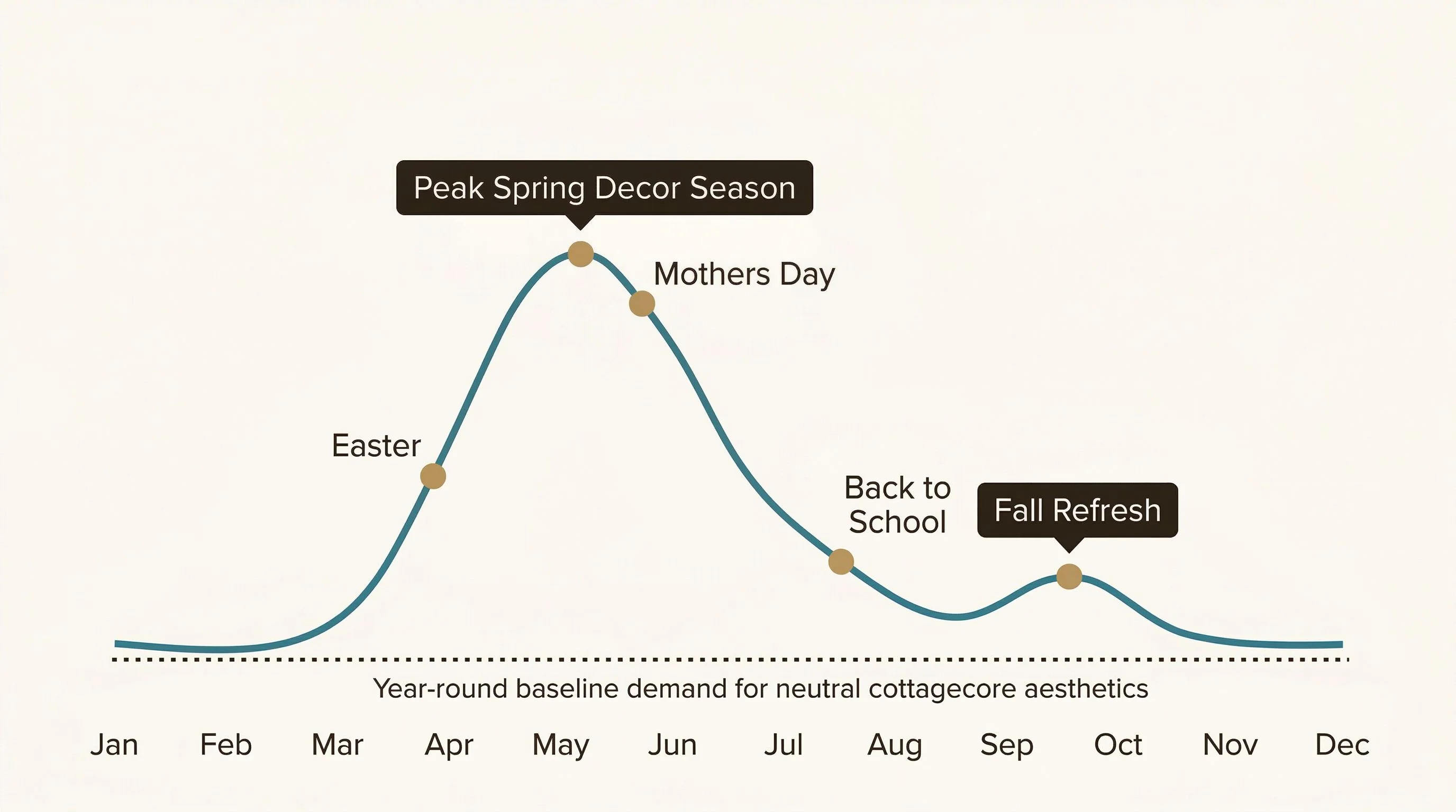
Spring is honestly one of the best windows for the home decor and wall art space. Buyers are refreshing rooms, looking for lighter palettes and nature-inspired pieces after winter. If you're thinking about entering the printable wall art space, this is the season to have your listings live and indexing.
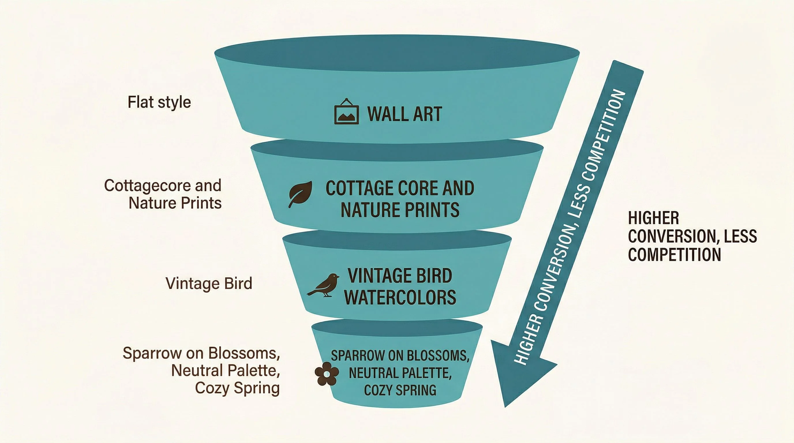
The aesthetic is the niche
Look at the full title: Vintage Sparrow and Blossoms Printable Art, Cottagecore Watercolor Botanical Decor, Neutral Colors, Cozy Spring, Digital Art Download. That title isn't a description. It's a search strategy. Every phrase is doing a job.
"Vintage Sparrow and Blossoms" is the niche anchor. It's specific enough that there's very little direct competition, but broad enough that Etsy's algorithm can match it to "bird wall art," "watercolor sparrow," and "botanical decor" searches. The tag data confirms this. The top-performing tag isn't the product-specific one. It's "cozy neutral." That's the lifestyle search, the aesthetic search, the one that pulls in buyers who don't know what they want yet but know how they want their home to feel.
Then there are the niche-specific tags doing the conversion work: "sparrow print" and "blossom painting" rank well because they're precise and low-competition. The listing is casting two nets at once. One for the aesthetic browsers, one for the intent-driven buyers who already know they want a bird print.
And the format strategy amplifies this further. Five JPG files covering every major print ratio, from 4x6 to A1. That means this single listing ranks for format-specific searches like "5x7 bird printable," "8x10 downloadable prints watercolors," and "11x14 digital download." Etsy's click query data shows over 200 search terms driving traffic to this one listing. That's not luck. That's architecture.
The mockups are doing the selling
This listing uses 10 images. Not three. Not five. Ten. And every single one is doing strategic work.
There's the artwork itself, of course. But the real selling happens in the room mockups. Each image places the sparrow print in a different room: hallway, nursery, bedroom, study, living room, home office, dining area. The alt-text on each image is rich with room-specific keywords and descriptors like "watercolor," "cottagecore," "vintage," "neutral palette."
Here's the thing: for a digital download, the buyer can't hold the product. They can't see it on their wall before they buy. The mockup is the product experience. A flat JPG on a white background tells the buyer nothing about how it'll look in their home. A styled room mockup tells them everything. It answers the question "will this work in my space?" before the buyer even has to ask it.
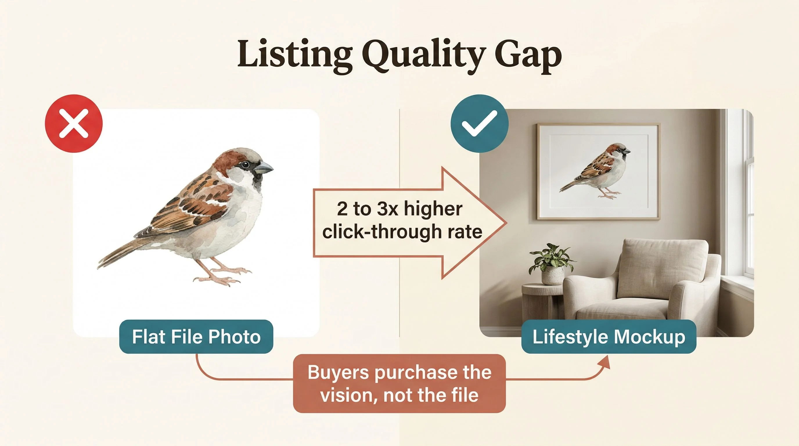
Each room mockup also functions as a separate search entry point. A buyer searching "nursery wall art" might land on this listing through the nursery mockup image. Same listing, different door in.
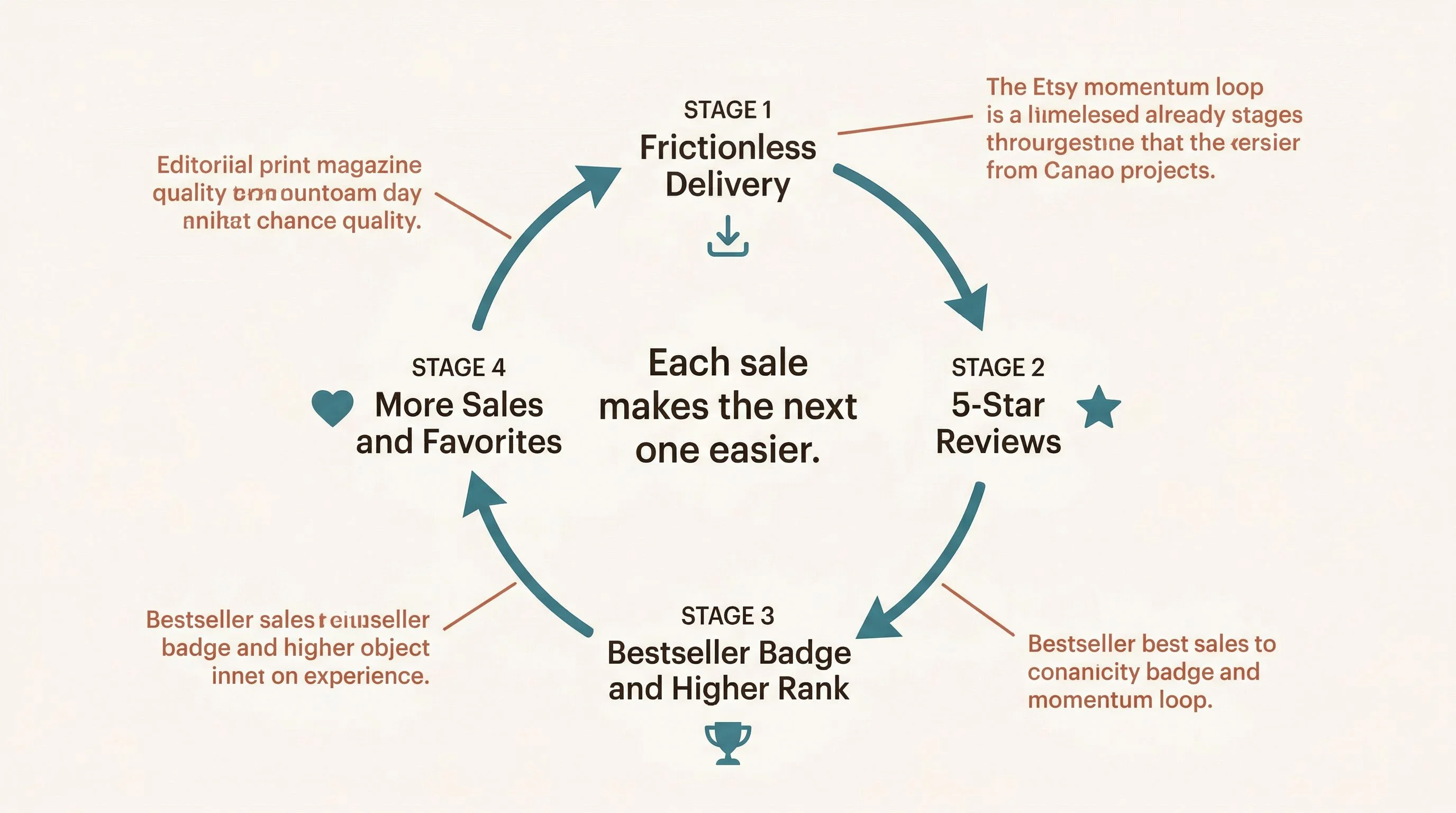
The operational polish that most people skip
The reviews tell a story. They're short. They're all five stars. And they all say basically the same thing: easy download, pretty art, love it. That might seem unremarkable, but it's actually the point.
This listing didn't stumble into consistent daily sales. Every detail, from the five size ratios to the room-specific mockups to the under-$3 impulse price, was designed to remove friction and let the product compound.
Nobody's confused about what they're getting. Nobody's struggling with the file format. Nobody's asking where the download link is. The reviews are all five stars. Item quality, customer service, the whole spread. The post-purchase experience is as polished as the listing itself.
This is where sales start compounding. Clean delivery leads to five-star reviews. Reviews earn the Bestseller badge. The badge increases click-through rates. Higher clicks improve search ranking. Better ranking drives more sales. And the loop keeps turning.
At $2.98, the price also does something important: it removes the decision. There's no "let me think about it" at three dollars. It's impulse territory. And every impulse sale is another data point telling Etsy this listing converts. The click query data even shows "cheap printable art" as a traffic source. The pricing is pulling in budget-conscious buyers who might never click on a $12 listing.
The $2.98 price isn't just a psychology trick — it changes the math of your whole catalog. See what your own income target requires.
Your micro-niche opportunity
The formula here isn't about sparrows. It's about the intersection: a specific subject (bird), a specific aesthetic (cottagecore, watercolor, neutral palette), a specific format (digital download with multiple size ratios), and a specific price point (under $3). You can run that same formula with completely different subjects.
Think about what else lives in the cottagecore and vintage nature space: herb garden illustrations, vintage butterfly prints, pressed wildflower art, robin or wren watercolors, woodland mushroom prints, lavender sprig botanicals. Each of those could be its own listing set using the exact same approach. Same tag architecture, same multi-room mockup strategy, same size ratio coverage, same impulse pricing.
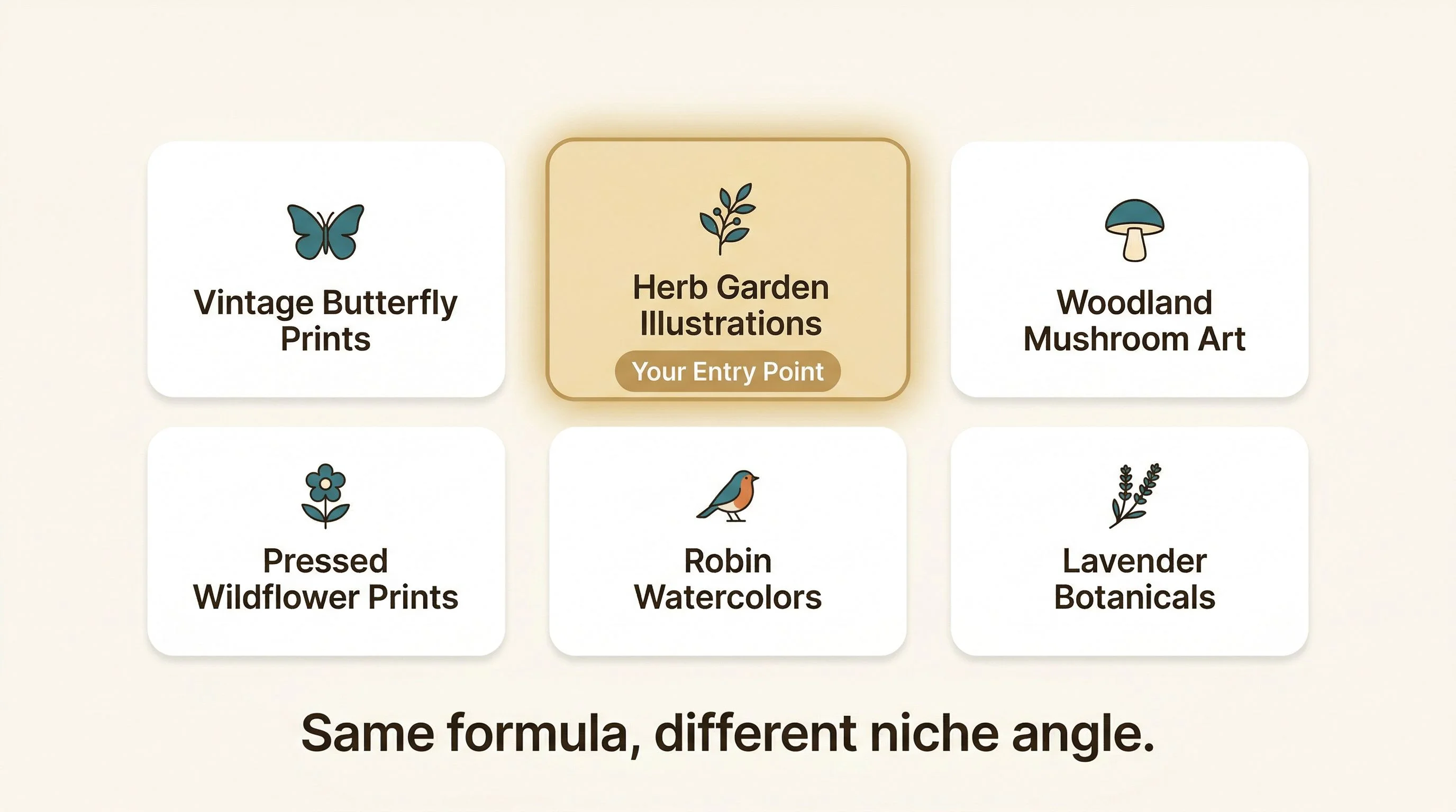
The tag data gives you a clue about where to look. "Cozy neutral" is the highest-performing aesthetic tag on this listing by a wide margin. Any product that fits the cozy neutral aesthetic has a built-in audience waiting. The question is just which subject you pair it with.
The execution is simpler than you think
This is a digital download listing. There's no inventory, no shipping, no print-on-demand provider in the middle. The seller creates the art, exports five JPGs at different ratios, uploads them to Etsy, and that's the fulfillment pipeline. Every sale after that is pure margin.
The listing discloses that the artwork uses an AI base developed into a final piece with digital painting. That's the production model: generate a base with an AI image tool, refine it, export it in the right ratios, build mockups showing it in styled rooms, and list it. The creative work is in the curation and the presentation, not in painting every brushstroke from scratch.
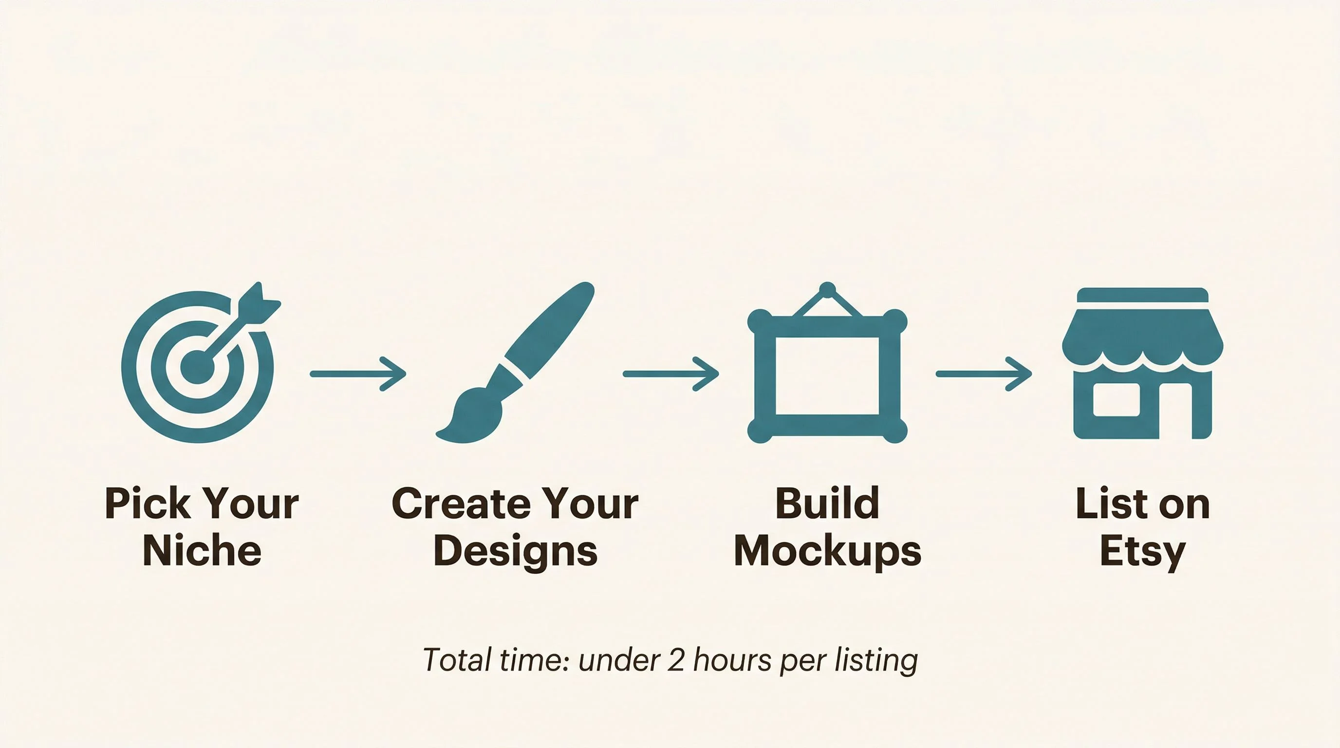
You don't need a design degree or years of illustration experience. You need a well-researched niche, a consistent aesthetic, room mockups that make the art feel like it already belongs in someone's home, and a listing built with the same attention to detail you just saw in this teardown.
Pick your niche. Create your first five designs. Make the mockups count. Write a title that's built for search, not just description. And let the momentum start building.
— Nick, Second Stream Journal