One hundred and fifty-four coloring pages.
That's how many one small shop in a California beach town has listed on Etsy right now. Not a collection. Not a starter pack. One hundred and fifty-four individual digital downloads, sitting quietly inside a single section of their store, alongside their shirts, their fonts, their party printables, and a thousand other small things. That shop has done the kind of volume most direct-to-consumer brands chase for a decade and never hit.
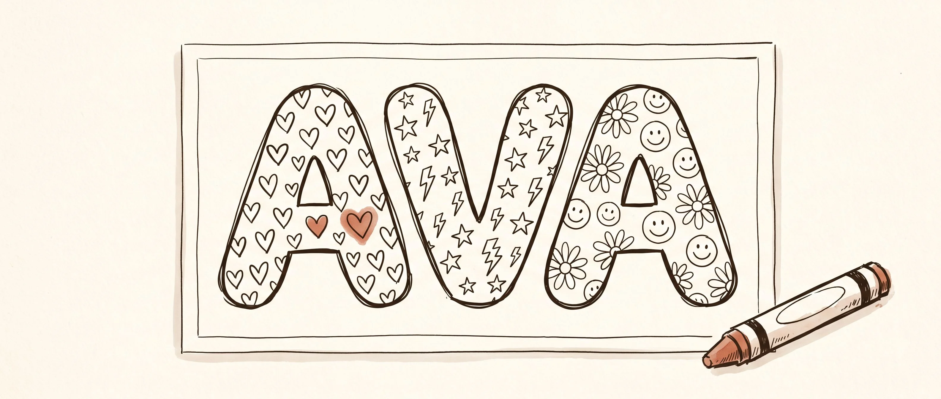
You found them the way everyone finds them. You were looking for a classroom activity, or a party favor, or something to print off for your daughter's sleepover, and this little listing kept showing up near the top of the results. A kid's name in big bubble letters filled with hearts and stars and lightning bolts. Bestseller badge. A few hundred favorites. Six sold in the last 24 hours. It looked so small you almost didn't click.
Here's the thing that should bother you, in the way that makes you stop and ask how. That listing is growing about eight times faster this month than it was last month. And it's still not even one percent of what the shop around it is doing. The coloring page isn't the business. The coloring page is the doorway into the business. And once you see the shape of what's on the other side of that door, you stop seeing a small download. You start seeing something that might actually work for you.
The timing is not an accident
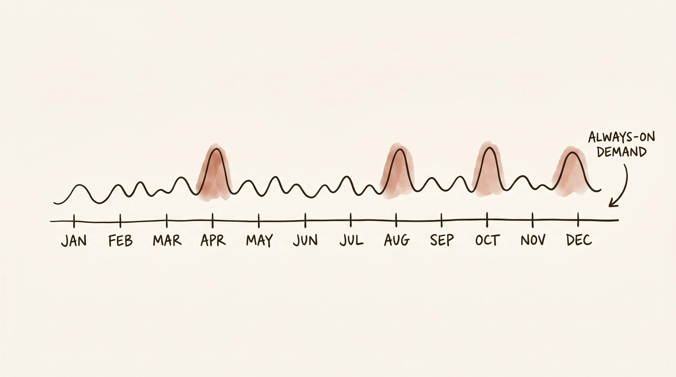
Coloring pages have a strange and wonderful demand curve on Etsy. They don't have one peak like Christmas ornaments or one drought like swimsuit cover-ups in February. They have dozens of small peaks, every week of the year.
Every birthday party. Every classroom Friday. Every "mom, I'm bored" on a rainy Saturday. Every teacher planning for back-to-school, every sleepover, every road trip. The searches that bring buyers to this exact listing include "sleepover activity page," "classroom name practice," "kids birthday coloring sheets," and a long tail of people literally typing their child's name followed by "coloring page" into Etsy's search bar.
Spring is an especially strong moment for this category. End-of-year classroom activities, summer birthday parties starting to get planned, the beginning of vacation season when parents need something to throw in a tote bag. If you're thinking about entering this niche, right now is one of the better windows of the year.
The aesthetic is the niche
Look at the title again: "Personalized Name Coloring Page: Fun Patterns (Digital Download)."
That's a lot of work in seven words. "Personalized" captures the custom-gift buyers. "Name Coloring Page" captures the specific product searchers. "Fun Patterns" differentiates it from character-based competitors who are fighting over Disney and Marvel knockoffs. "Digital Download" sets the expectation and filters out anyone looking for physical shipping.
And the product design itself is doing something smart. The patterns are hearts, stars, lightning bolts, daisies, and happy faces. That's it. No characters. No licensed anything. No seasonal lock-in. It works in April, it works in October, it works for a 4-year-old girl's birthday, it works for a 10-year-old boy's classroom activity. One file, dozens of buyer moments.
The tags spread a wide net in exactly the same way. Some tags lean into the classroom and teacher angle. Some lean into the birthday party angle. Some pick up the personalization angle where a parent is typing their child's name and hoping someone made a page for it. It's the same product seen from different doorways, and each doorway has its own crowd.
Here's the principle: specificity in the product, breadth in the discovery. One hyper-specific product, many search intents feeding into it. That's the shape you want.
The mockups are doing quiet work
The listing has five images and a short product video. I want you to notice what it doesn't have. It doesn't have a huge gallery of the same page with twenty different names on it. It doesn't have complicated infographics explaining how to download. It doesn't have a row of stock-image children holding up the finished coloring page.
It has exactly enough to show a parent what they're buying and how it's going to look when their kid is sitting on the kitchen floor with a box of markers. That's the entire job of the listing imagery.
For digital products, the mockup isn't supporting material. The mockup is the product. The buyer can't hold the PDF. They can't flip through it in a store. Everything they believe about what they're paying for comes from those five images. Get the mockups right and you barely need to do anything else. Get them wrong and no amount of tag optimization will save you.
The lesson from this listing isn't "make a coloring page." It's "find a small, clear, always-in-demand product, build one great version of it, and let the search engine keep bringing you buyers for years."
The operational polish that most people skip
The listing has one design. One file type. One clear offer. The description explains exactly what you're getting, how to download it, how long the turnaround is, and what to do if you need multiple names.
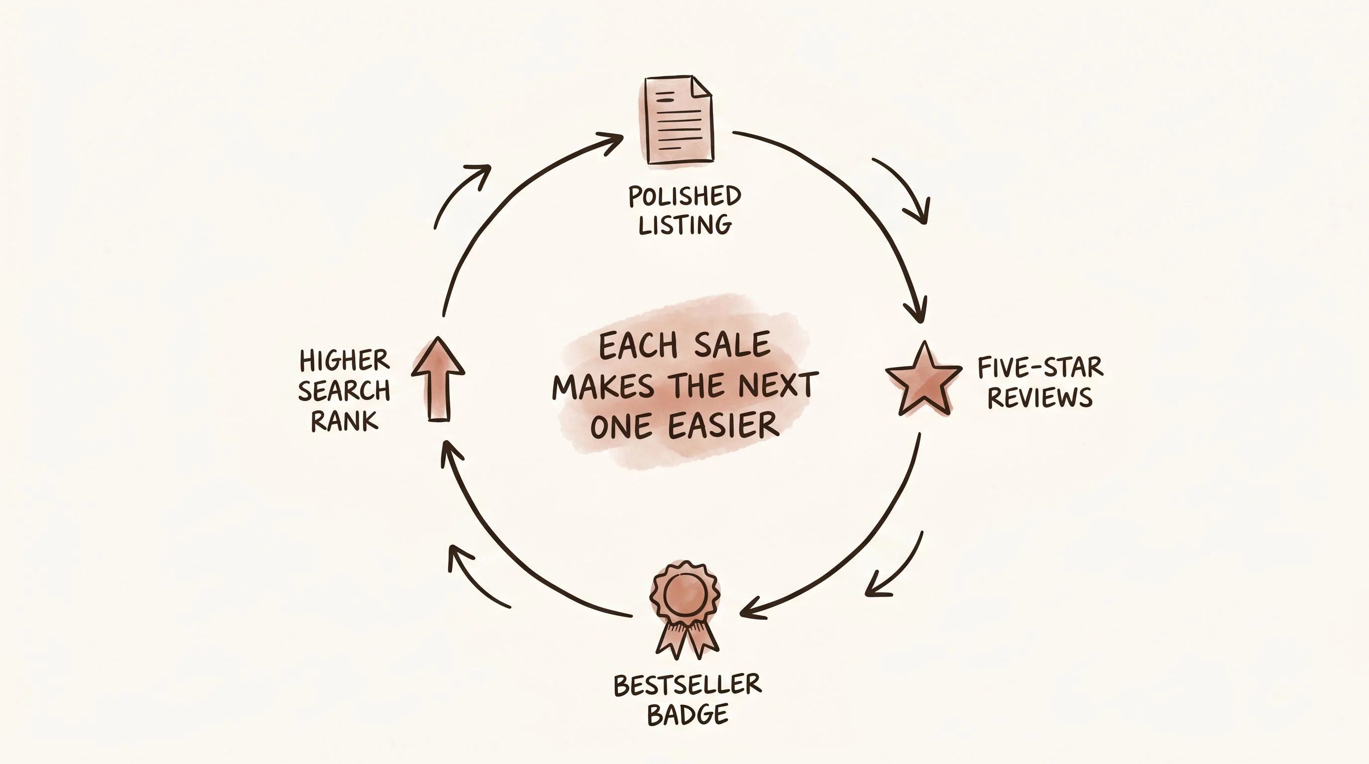
The reviews are all five stars and they all say roughly the same thing. Fast delivery. Great communication. Kids loved it. One reviewer mentions using it with a class of 5th graders. Another mentions how quickly the seller responded. This is what a quietly excellent operation looks like from the outside. No fireworks, just the same thing done correctly every single time.
And here's how that compounds on Etsy. Every clean transaction creates a five-star review. Reviews at volume trigger the Bestseller badge, which you can see on this listing. The Bestseller badge pushes the listing higher in search. Higher search rank creates more impressions, which creates more sales, which creates more reviews, which raises the badge threshold, which pushes it higher again.
None of this is difficult. But almost nobody does all of it consistently.
The shop behind the listing is the real lesson
Let's go back to those 154 coloring pages, because this is the part that changed how I think about this entire niche.
That coloring pages section is one of roughly eighteen sections in the shop. There's one for Mother's Day, one for birthdays, one for Easter, one for Halloween, one for Christmas, one for teacher appreciation. There are shirts. There are custom fonts. There are SVG bundles. The shop has been quietly doing this for nine years. Sixteen thousand reviews, all sitting at a 4.9. Three owners, each with a specialty: one designs, one produces, one handles customer service.
And the listing we started with, the little coloring page with the lightning bolts and daisies, is one of almost sixteen hundred active listings they're running right now. Sixteen hundred. That's not a shop. That's a catalog. That's a business.
Here's the theory I want you to sit with. A low-ticket digital product isn't the destination. It's the front door. It's how you get your first review, your first Bestseller badge, your first thousand customers, your first real feel for what your niche responds to. The shop we're looking at didn't start at a hundred and fifty-four coloring pages. They started at one. The coloring page is the lowest-friction way to open that door, and everything you build after it gets easier because that door is open.
That's the real pattern. Not "one breakout listing." Not "one viral product." It's a catalog of small, honest, useful things where every single one is good enough to earn a few sales a month, and together they form a shop that pulls in meaningful revenue for years at a time. The low-ticket items are the on-ramp. The compounding is the business.
The coloring page niche is one of the most forgiving corners of Etsy for a beginner, and this shop is proof of what that looks like when someone commits. You don't need to build the whole thing in a month. You need to build one good listing. Then another. Then another.
Your micro-niche opportunity
Here's where you come in, because the opportunity inside coloring pages is genuinely wide open.
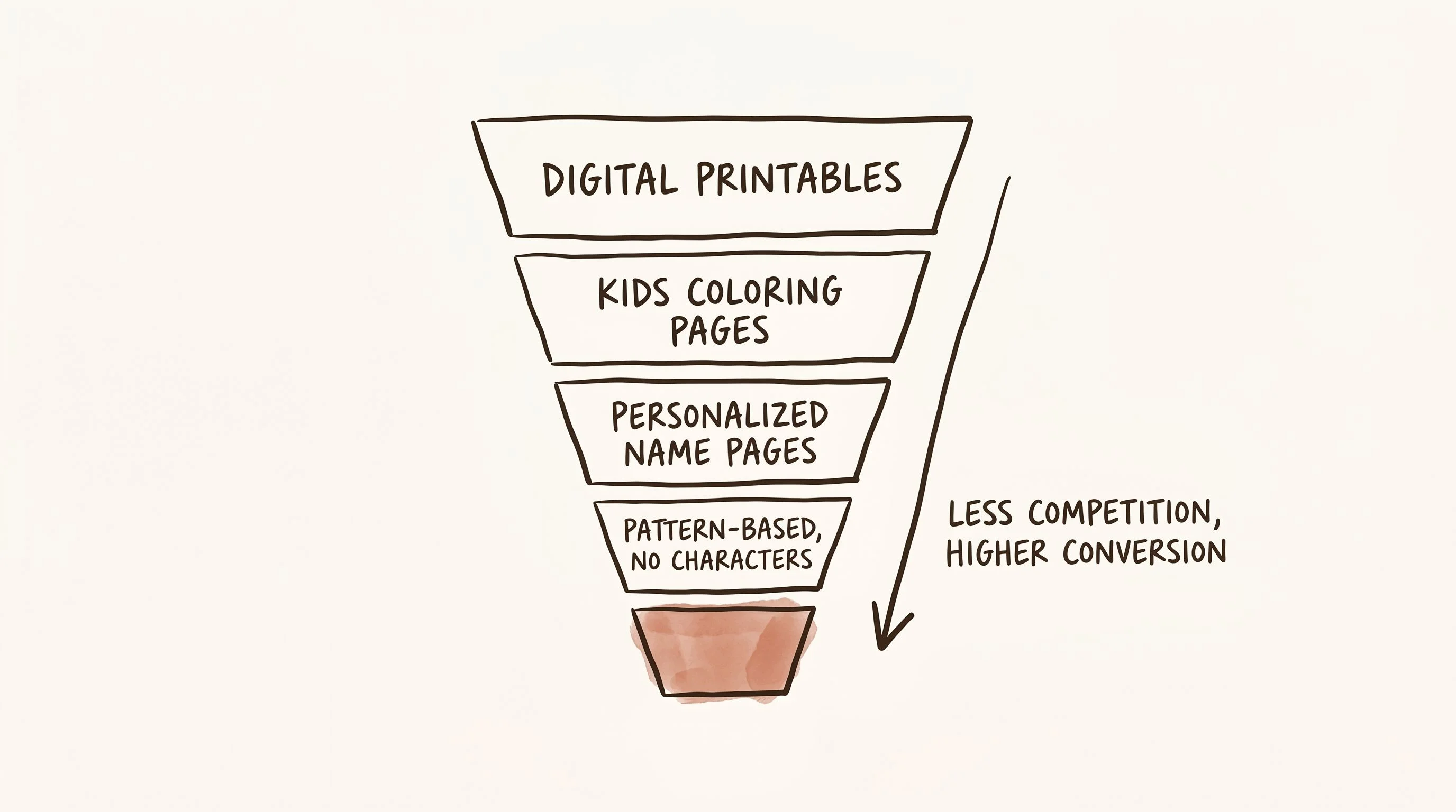
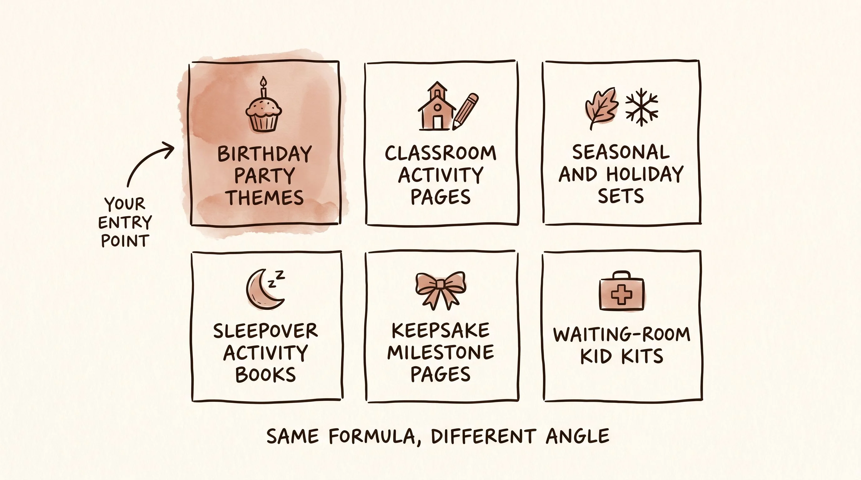
Personalized name pages are one angle. But the door is much bigger than that. There are themed coloring pages for birthday parties (mermaid, dinosaur, construction, unicorn, space). There are classroom activity pages for specific grades or specific subjects. There are seasonal pages for every holiday the major retailers don't quite cover. There are sleepover-specific activity books. There are "I survived kindergarten" end-of-year keepsake pages. There are pages designed for waiting-room use in pediatric clinics and dentists' offices.
The deeper you go, the less competition you'll find. "Mermaid birthday coloring page" has hundreds of sellers. "Mermaid birthday coloring page for an 8-year-old with her name and a custom age" has almost none. The specificity is your competitive advantage.
You don't need to be an illustrator. You don't need a graphics tablet or a design degree. You need one aesthetic direction, a handful of templates, and the willingness to sit down and make five listings in a weekend. That's the entry bar.
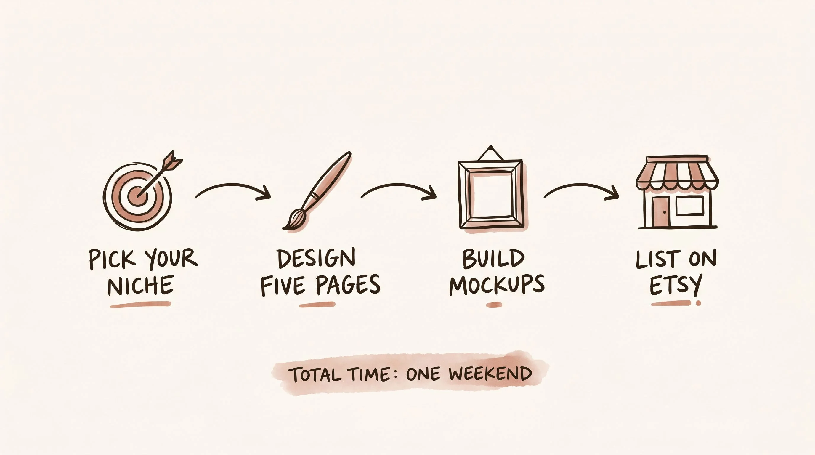
The execution path is shorter than you think
Pick a niche. Pick an aesthetic. Make five coloring pages. Build mockups that actually show what they look like printed and in use. Write descriptions that tell the buyer what they're getting, how to download it, and what to do with it. List them.
That's the whole thing. No inventory, no supplier negotiations, no shipping labels, no wholesale minimums. You're selling a PDF. The buyer prints it at home. The margin is essentially 100% on every sale for the rest of the listing's life.
The reason people stall in this niche isn't the work. It's that the work looks too small to matter. One coloring page seems insignificant. Five seems like a hobby project. Twenty starts to feel like a business. A hundred and fifty-four is a shop that generates real income for nine years.
The math is simple. See exactly what it takes to reach your number.
The hard part isn't the work. It's knowing which prompts produce the clean printable line art buyers actually want, which aesthetics hold up month after month on Etsy, and how to wire a handful of listings into a catalog that compounds. That's what the next course is for.
Start with one aesthetic, one buyer moment, and five listings. Don't try to build the catalog all at once. Build the first page well, list it with care, and let it teach you what to make next.