Right now, in church halls and living rooms all over, kids are partway through a week of Vacation Bible School. Somebody bought the coloring pages and activity worksheets they're working on this morning. Somebody will buy next week's, and the week after that, right through August.
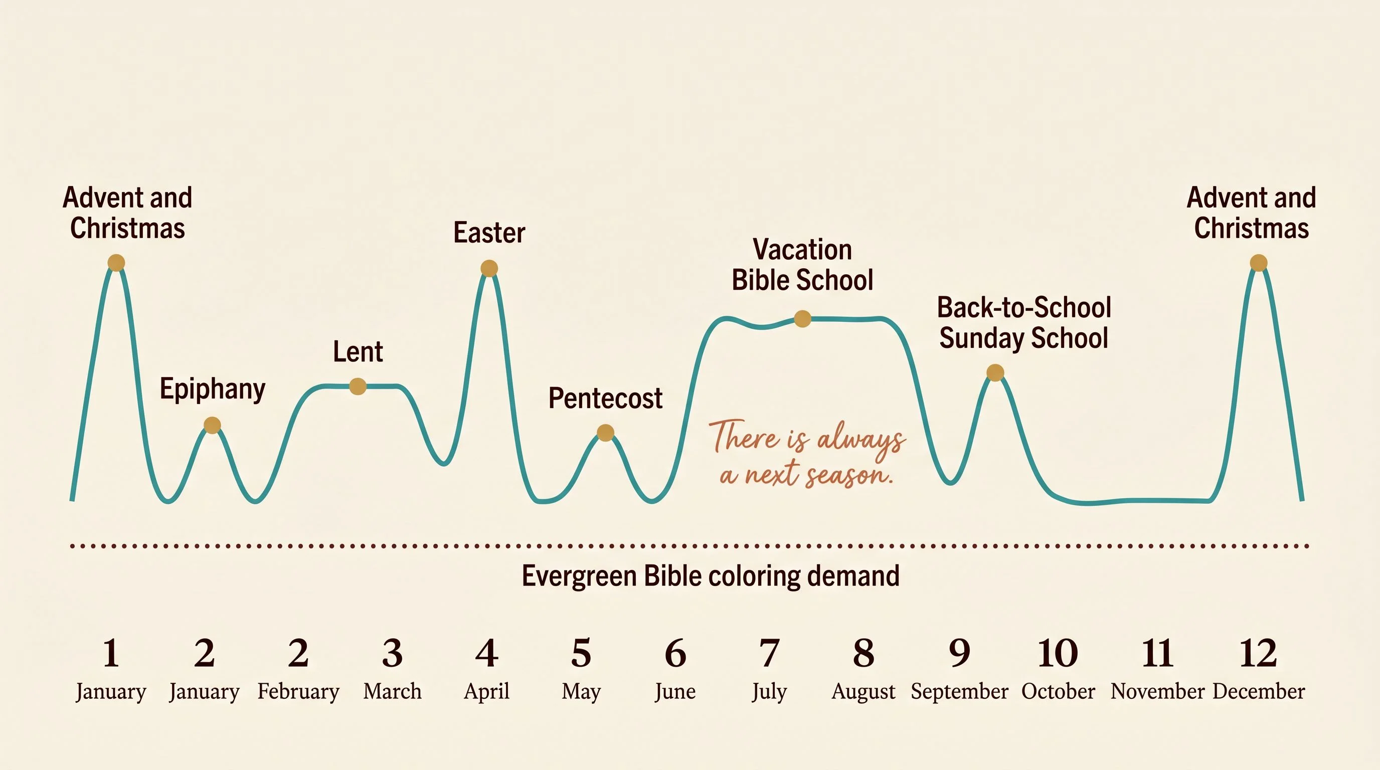
Then the season turns and it starts again. Sunday School in September. Advent in December, Lent in February, Easter at the start of spring, Pentecost at the end of it, and back to VBS next June.
None of that is a lucky streak. It's a calendar, the same one every year, and it might be the most predictable demand engine on Etsy. The strange part is how few people sell to it on purpose.
The timing is built into the religion
You just watched the engine run. The reason it works is that faith doesn't get one season a year, it gets a dozen, and they land in the same order every time, as predictable as a tide table.
Most niches get one or two seasonal peaks and go quiet in between. Faith education gets a peak almost every month, and the buyers, Sunday School teachers, homeschool parents, children's ministry leaders, come back for the next one because their job comes back for the next one.
That's the part most sellers miss. They treat a Christmas or Easter product as a one-off and let it go cold. The winners treat the calendar as a schedule. Right now, in mid-June, the season to be ranking for isn't Pentecost, which has already passed. It's VBS, which runs straight through summer, and the fall Sunday School materials teachers start buying in August.
The niche is narrow on purpose
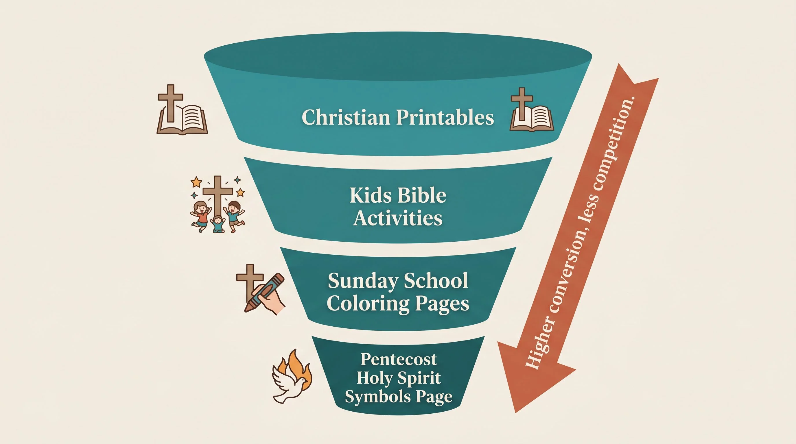
Here's where a lot of people stall. They look at "Christian printables," see how crowded it is, and walk away. It is crowded at the broad level. It's wide open one layer down.
Look at how the listings that win these searches are actually built. Underneath them sits a broad evergreen base of terms that pull traffic all year, things like Bible coloring page, kids activity, bible craft, Sunday School. On top of that sits one hyper-specific moment from the calendar: the symbols of the Holy Spirit for Pentecost, the stations of the cross for Lent, the nativity for Advent.
The broad terms bring the traffic. The specific ones barely get searched at all, so they're not pulling visitors. What they do is win the click, because a teacher who needs exactly that page recognizes it instantly and trusts it'll work before reading the description.
That's the formula for the whole niche. Ride a broad, recurring term to get found, then convert with a page so specific the buyer knows it fits their lesson on sight. The titles do the same thing, leading with the season and then stacking every context a buyer might search, coloring page, activity for kids, Sunday School, Confirmation, sacramental prep, so one page catches half a dozen different searches.
For a printable, the images are the product
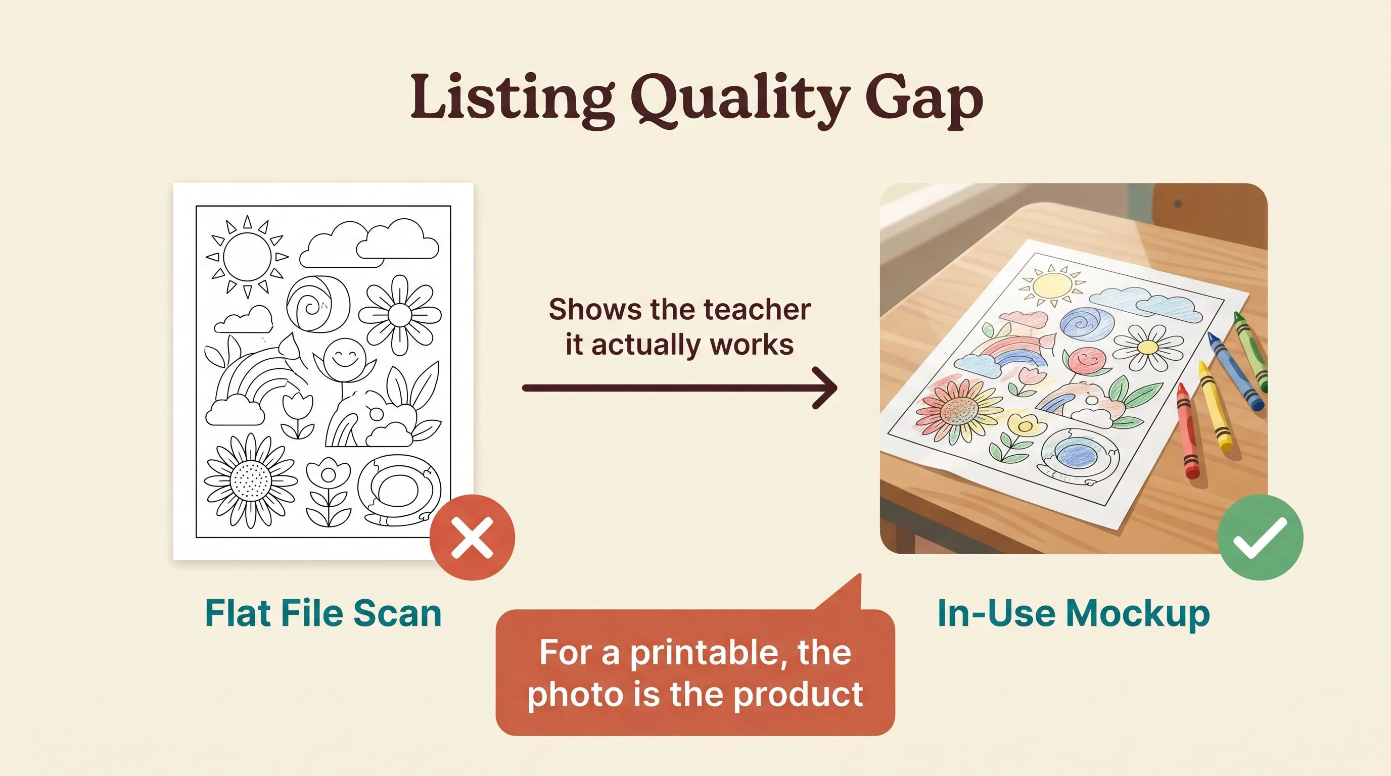
A digital download has a problem a physical product doesn't. The buyer can't hold it, can't feel the paper, can't flip it over. All they have is your photos, so in this niche the images aren't marketing for the product. As far as the shopper is concerned, they are the product.
That's why the strong listings use several images for what is, in the end, a single page. The carousel isn't showing variations. It's teaching and reassuring. The design itself, the symbols up close so a parent can read the little Scripture lines, the page printed and in use, a quiet reassurance that it'll come out clean on an ordinary home printer.
For a Sunday School teacher scanning fast on a Tuesday night, planning Sunday's lesson, that clarity is the whole sale. They need to know in three seconds that this prints, this colors, and a room full of kids can do it. Good mockups answer all three before they've read a word, and that's the single highest-leverage thing you can invest in here.
How a brand-new shop beats the veterans
Great mockups get the click. What keeps a listing climbing is everything that happens after it, and it's mostly the boring stuff sellers can't be bothered to do.
Instant delivery. A format stated plainly, one PDF, US Letter, print at home. Reviews answered with a warm, personal thank-you. A companion page offered as a buy-together-and-save bundle, which lifts a sub-three-dollar order into a multi-item sale. None of it is hard. Almost nobody does all of it.
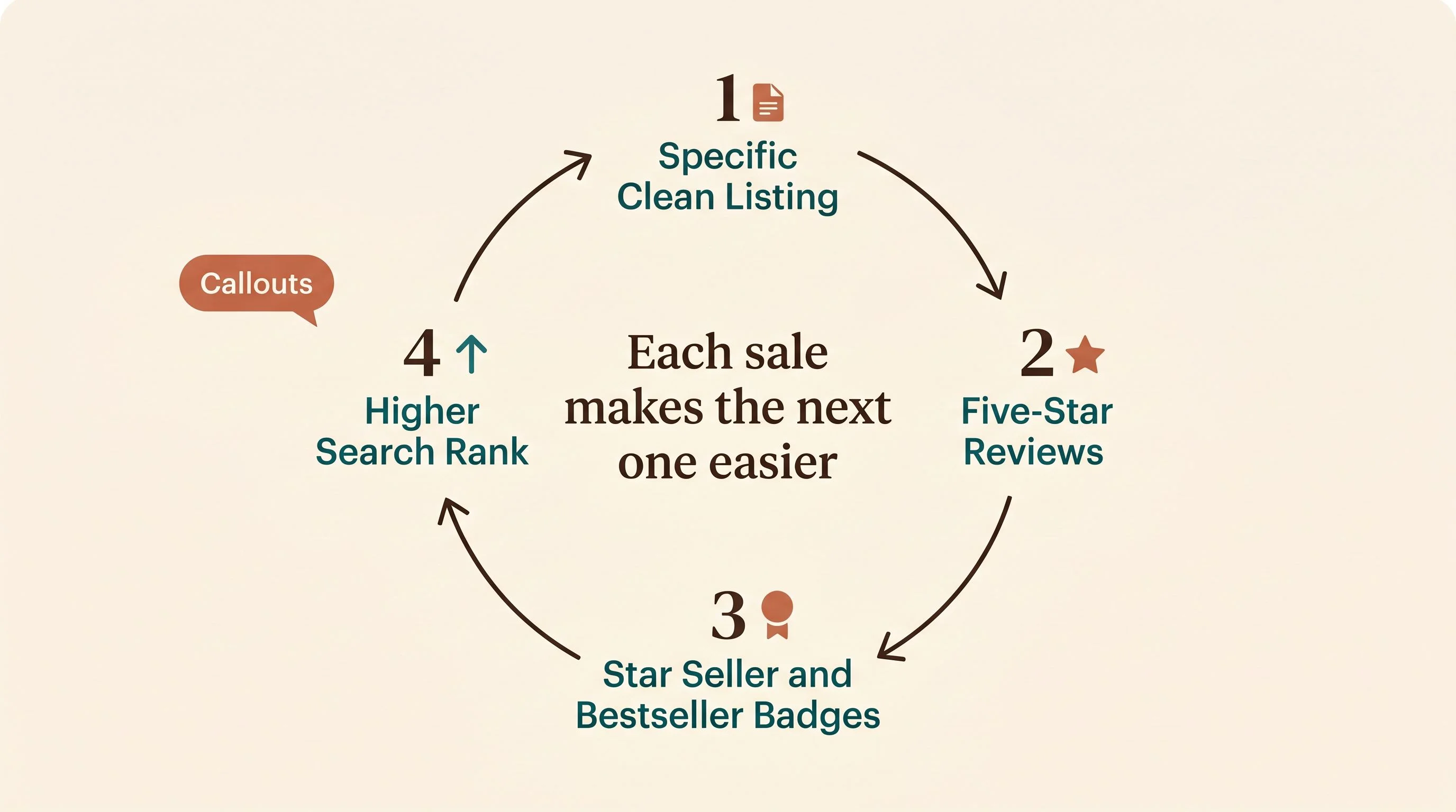
And on Etsy, doing all of it is what turns the wheel. A clean, specific listing converts. Those sales bring five-star reviews. Reviews and steady sales earn Star Seller and Bestseller badges. The badges and the velocity push the listing higher in search. Higher rank brings more buyers, more reviews, and the whole thing tightens on itself. Each sale makes the next one easier.
That's how a shop only a few months old can sit above stores that have been around for years. It isn't one lucky product. It's showing up for each season with a clean page and letting the wheel keep spinning.
The sellers winning this niche didn't find a secret product. They found a calendar that repeats every year and showed up early for each season with one clean page.
Where your opening is
The reason this niche is worth your attention is that it's deep. One Pentecost page is a single point on a calendar that has dozens of points, and most of them are still under-served at the specific level.
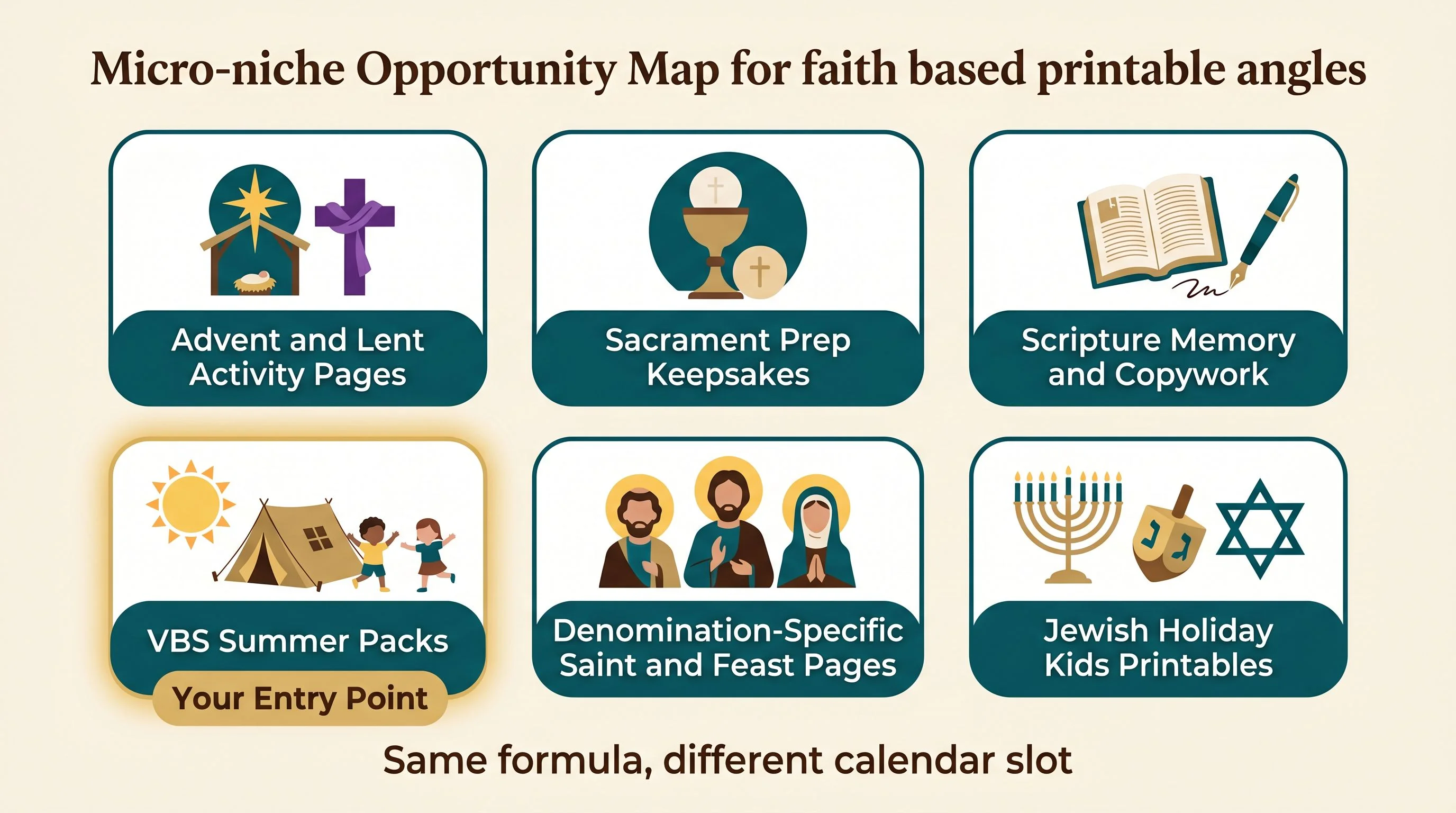
Walk the calendar and the openings name themselves. Advent activity pages and a Lent journey for kids. A Holy Week sequence and Epiphany crafts. Sacrament prep is its own evergreen world: First Communion keepsakes, Confirmation activities, Baptism printables that double as gifts. There's scripture memory work, Bible verse copywork, and Proverbs handwriting pages that ride the faith-plus-homeschool crossover. There are VBS activity packs aimed squarely at the summer you're sitting in right now.
You can also go denomination-specific, where the competition thins out fast, with Catholic saint pages, Orthodox feast-day activities, or Protestant catechism sheets. And the same exact formula travels to other faiths entirely. Hanukkah, Passover, and Rosh Hashanah printables for kids follow the identical pattern of recurring calendar plus evergreen base, with far fewer sellers doing it well.
Pick one lane on that calendar. You don't need all of them. You need one season you can own with a small, cohesive set of pages, listed early enough to be ranking before the buyers arrive.
The part that's easier than you think
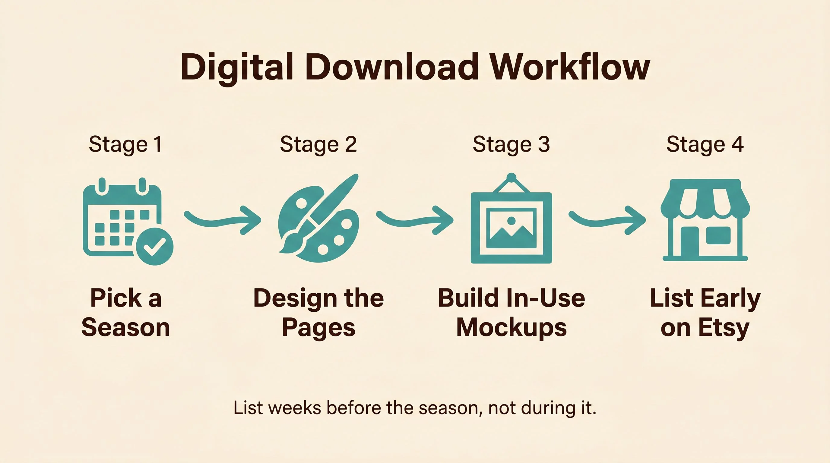
The product itself is about as simple as digital products get. You design a clean, thick-line page built for early readers, you generate a few in-use mockups so the teacher can see it working, and you list it. AI image tools handle the line art and the mockups now, so the design work that used to take a day takes an afternoon.
The leverage is in the research and the timing, not the labor. Decide which season you're claiming, build a small set of pages around it, make the mockups genuinely good, and write a description that answers a busy teacher's real questions about format and printing. Then list it early, weeks ahead of the season, so Etsy has time to learn the listing and rank it before demand peaks.
That's the whole move. The calendar tells you what to make and when to make it. Your job is to show up before the rush with one clean page.
Look again at what almost every one of these winners actually is, though. It's a printable a kid fills in: a coloring page, an activity worksheet, a matching or connect-the-dots sheet. The coloring page and the worksheet are the two workhorses of this whole niche, and they're the easiest place to start, which is exactly why they're worth getting right.
Because a printable that sells isn't just a nice drawing or a tidy worksheet. It's the line weight and the layout that print clean on a cheap home printer, the composition that photographs well in a mockup, the level of detail that fits the age you're aiming at. Those are small choices, and they're the whole gap between a page that gets scrolled past and one a teacher prints, uses, and comes back for.
You don't need a big catalog or a five-star wall of reviews to start. Pick one season off the faith calendar, build a small set of pages you'd be proud to print, and get them listed before the buyers come looking. The calendar will keep handing you the next one.
— Nick, Second Stream Journal