There's a particular kind of drawing showing up everywhere on Etsy this month. You've probably scrolled past it without thinking too hard about it. A clean black line, no shading, no color. A parent's shoulders. A child tucked into the curve of an arm. A face implied more than drawn. The kind of image that looks like someone sketched it on the back of an envelope in two minutes, and that you'd somehow still want to frame.
It's on shirts. It's on mugs. It's on prints. It's on tote bags and digital downloads and walnut-framed posters. And right now, four weeks out from Father's Day, it's the thing buyers are actually clicking on.
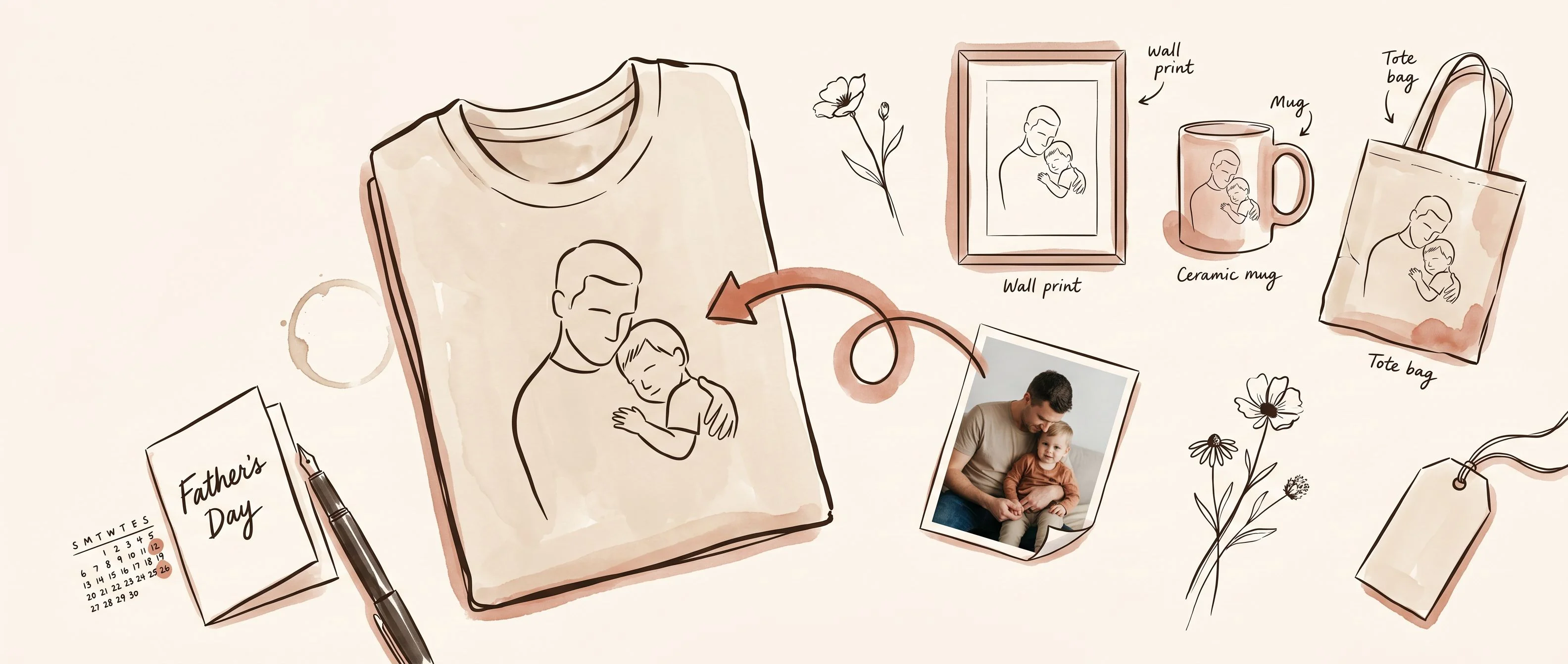
This shirt from a shop called TIMOTHYJACOBShop is one of the cleanest examples. The hero image isn't a lifestyle shot or a flat lay. It's the buyer's snapshot in the corner, an arrow, and the line drawing on a beige tee. The whole product, summarized in one image. You could look at it for half a second and know exactly what you'd get.
What's actually being sold
The instinct, when you see a listing like this doing well, is to call it a Father's Day shirt. That's not really what it is.
The shirt is just the surface. The product, the thing the buyer is actually paying for, is the line itself. A drawing simple enough that it survives a bad source photo. A drawing forgiving enough that the slightly-blurry hospital picture of a dad holding his newborn becomes something gift-worthy. A drawing minimal enough that it works at the size of a sticker, the scale of a framed print, or stretched across the chest of a t-shirt.
That's why you'll find essentially the same drawing style on a digital download in a different shop selling thousands of copies as a hand-drawn portrait. Different shop, different product, different price. Same line. The shirt and the print are interchangeable. The technique isn't.
Once you see it that way, the whole category starts to make more sense. Buyers aren't searching for "Father's Day shirt." They're searching for the feeling of having captured someone they love in a way that feels intentional. The line art is the cheapest, fastest, most forgiving way to deliver that feeling at scale.
Why this holiday in particular
Father's Day is interesting because it's a hard holiday to shop for. Mothers, partners, grandparents — there's a deep cultural script for those. You know what to buy. You know what to write in the card. You know how the gift is supposed to feel.
Dads are vaguer. The default options are the same five items recycled every June: a tie nobody wears, a grill tool nobody opens, a wallet to replace a wallet that's already fine. So buyers — most of them women, buying for fathers and husbands and father-in-laws — drift toward the thing that signals I actually thought about this. Something specific. Something that references a real moment, a real photo, a real person.
That's why a line drawing of a dad holding his actual child outperforms a generic "World's Best Dad" mug. It's not the medium. It's the specificity. The buyer isn't shopping for a shirt. They're shopping for proof of attention.
And the buyer is in a particular state of mind. She's been putting it off. Father's Day is in three weeks. She doesn't want to wander the mall. She types something vague into Etsy — "gift for dad from daughter," "personalized fathers day," "custom photo gift" — and a line drawing of a parent and child shows up, and there's a Bestseller badge on it, and the shirt is in someone's cart right now according to the page, and the price feels gentle, and the photo-to-drawing arrow on the first image answers the only question she had. She buys.
That whole moment, from search to checkout, is maybe ninety seconds. The seller who designed for that moment wins. The seller who designed a pretty shirt and hoped to be found doesn't.
The mockup is the whole product
Here's the part most new sellers underestimate. When the product is custom, the mockup is the product.
The buyer can't see what she's actually getting. She's about to upload a photo of her family and hope a stranger turns it into something worth giving away. That's a leap of faith. The thing that makes her actually take the leap is the first image on the listing.
The product is the line. The shirt is just where the line lives.
The strongest version of that first image is the one TIMOTHYJACOBShop uses: the buyer's photo in the corner, an arrow, and the final drawing on the shirt. It tells her we've done this before, your photo will work, here's what yours will look like. No paragraph of copy can do that. The image does it in under two seconds.
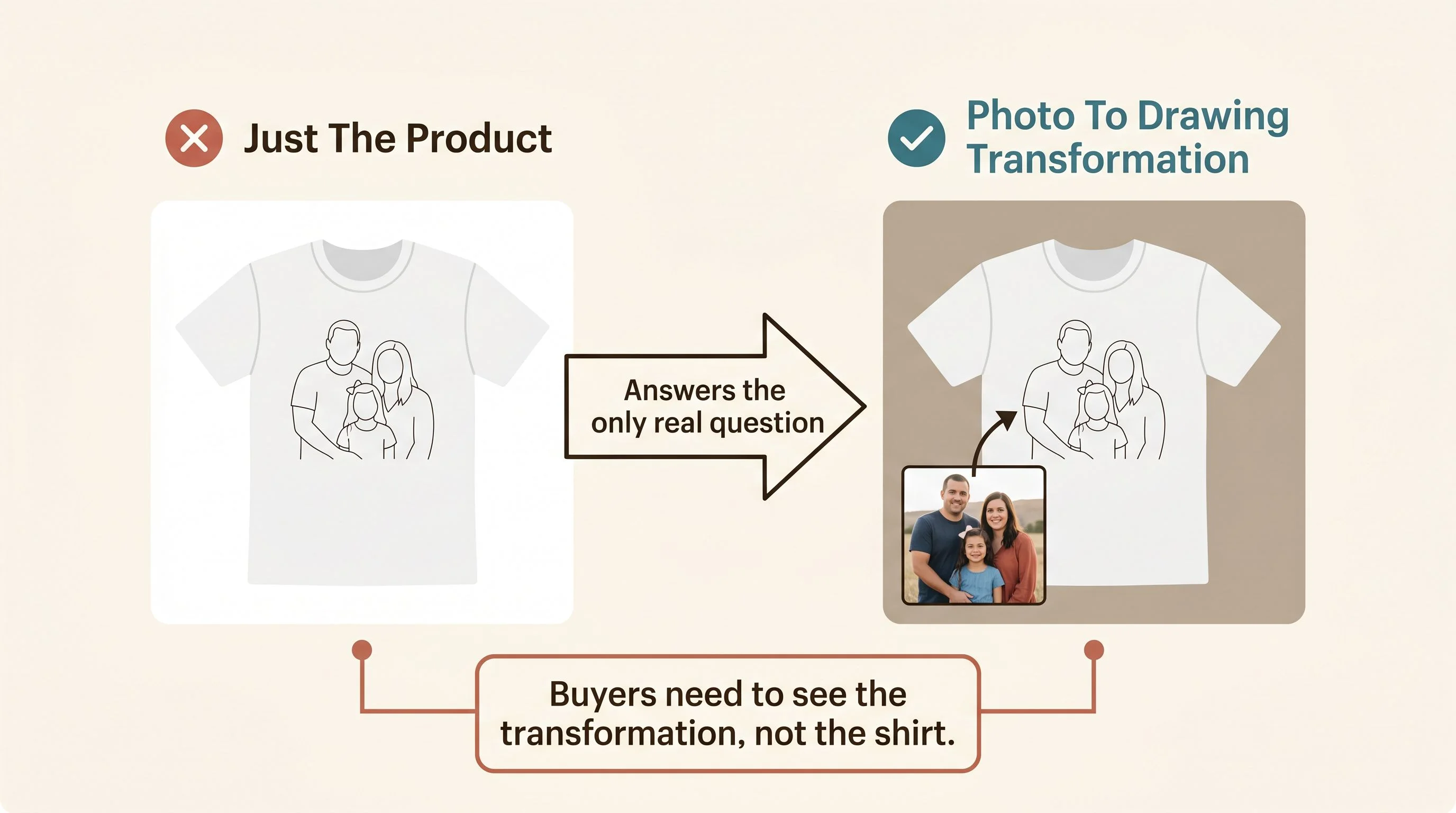
If you're going to take one thing from this teardown into your own shop, take that. Don't show your product. Show the transformation. Show the input next to the output. Show the buyer that her version is going to look as good as the version in the example. Every other lever on the listing matters less than this one.
The opening, when you look closely
Father's Day is the obvious entry point, and it's still wide enough this year that a listing put up this week can absolutely catch the late wave. But the more interesting opening isn't the holiday. It's the technique.
A line drawing from a photo works for almost any occasion where someone wants to give a gift that says I see you. The same minimal style that's selling on a Father's Day shirt sells just as well as a pet portrait, a couple's anniversary print, a memorial keepsake for someone who's been lost, a new-baby announcement, a wedding portrait, a "first home" gift, a grandparent on Grandparents Day. Same drawing technique, same mockup formula, same buyer psychology. Different occasion, different keyword cluster, dramatically less competition.
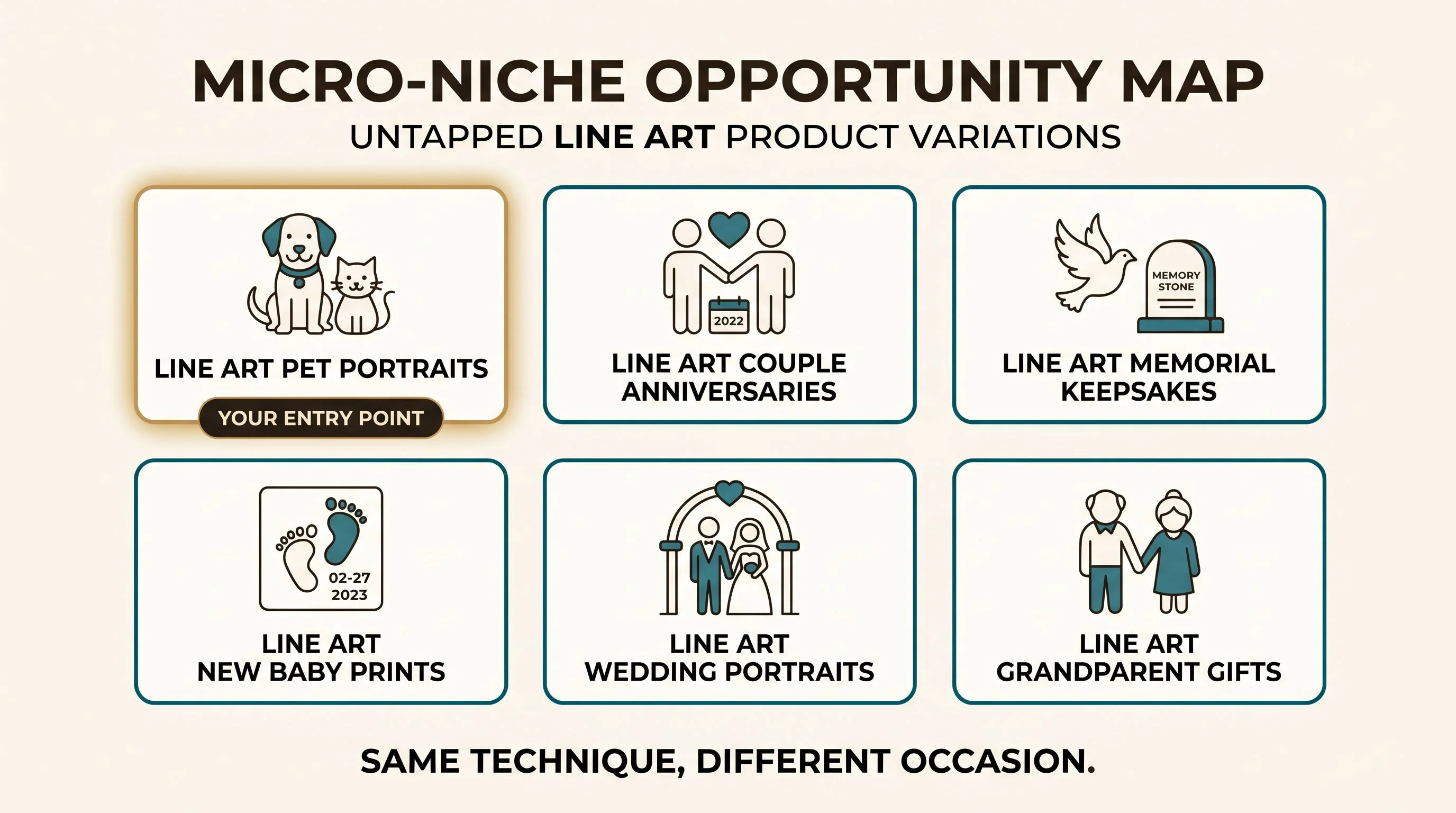
Pets are probably the softest entry. Pet owners spend on their pets the way no one else spends on anything. There's no partner to consult before the purchase. There's no awkward sizing or fit decision. And the photo-tolerance is even higher than with humans, because a slightly blurry shot of a sleeping dog turns into a line drawing that the owner is going to cry over regardless. Couples and memorial portraits sit a half-step behind in volume but with an even higher emotional ceiling on price.
The point isn't that Father's Day is too late. The point is that Father's Day is the demonstration. Once you see how this technique works in this season, you can run it through the rest of the calendar.
How the listing actually gets built
You don't need to draw any of this. You need to be able to generate the line art from a customer's photo, build a transformation mockup that shows it on a product, and put it up.
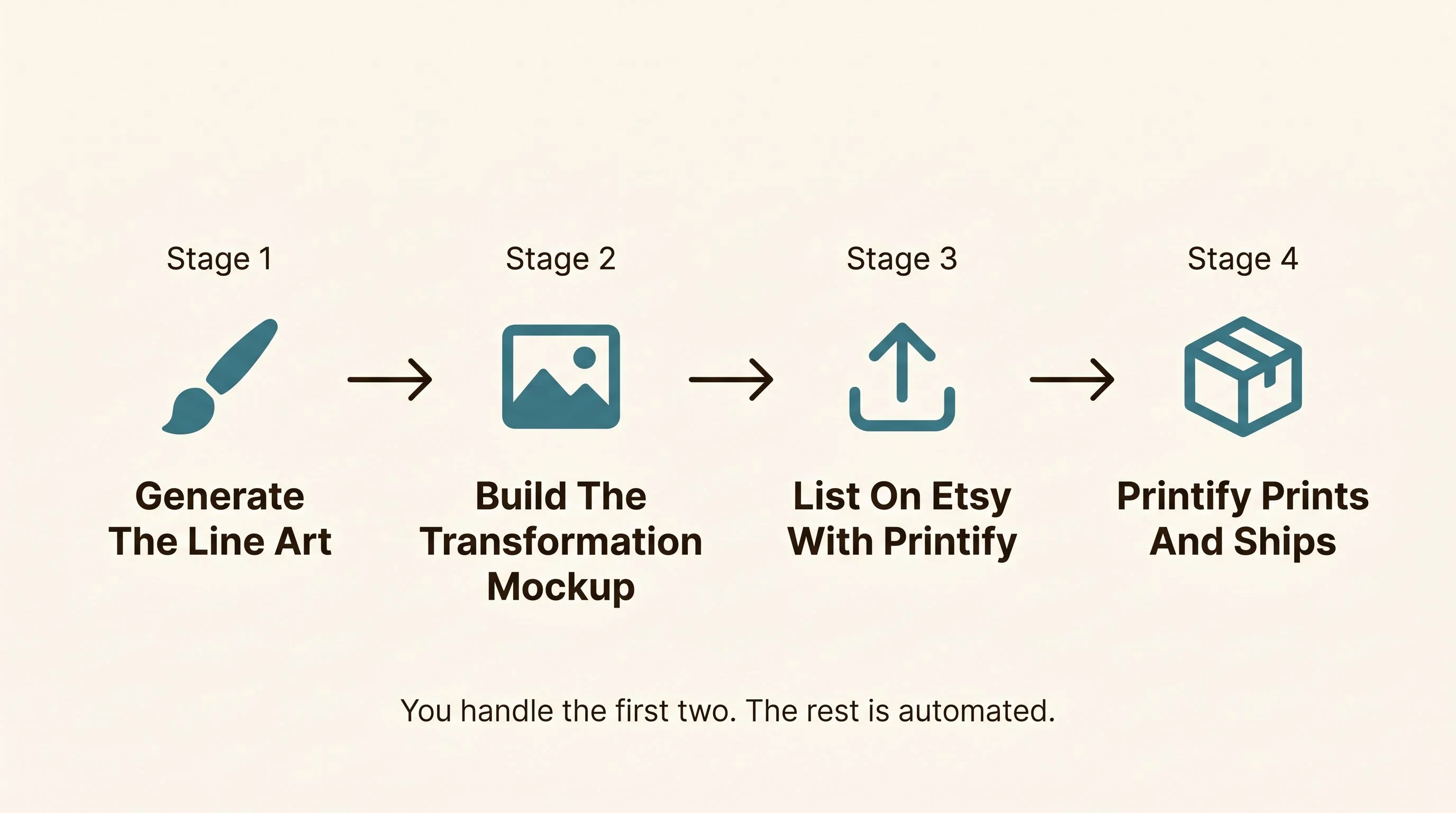
The line art itself comes out of any of the current AI image tools that handle photo-to-line conversion. The mockup is a templated scene you build once and reuse forever — a folded shirt, a framed print on a wall, a hand holding a mug — with your line art swapped in and the customer-photo arrow added. The product fulfillment is Printify if you're going physical, or a digital download if you're not. None of it is hard. It's a weekend of setup and a few hours per listing after that.
What takes the time isn't the production. It's the listing. The title that catches multiple search intents. The hero image that teaches the transformation. The handful of polished details — color options, size chart, clear FAQ, prompt replies to customer messages — that compound over the next year into the badges and reviews you see on the listings doing well today.
Pick the occasion you want to own. Pets, anniversaries, memorials, new babies — anywhere a customer wants proof of attention. Build three or four listings around the same line technique. Get the transformation mockup right. And let the next year do its work.