
LoveSuna has been on Etsy for six years. They've made nine million dollars. Three hundred and forty-eight thousand sales. Sixty thousand reviews. They sell hundreds of variations of personalized blankets, hospital outfits, baby announcements. They're not figuring it out. They figured it out a long time ago.
And one of their newest listings, a personalized wildflower baby blanket, is now responsible for almost 9% of their entire monthly revenue. It's been live since January. Sixteen weeks. In a shop with a catalog the size of a small department store, a single four-month-old experiment is now eating nearly a tenth of the volume that hundreds of older listings spent years building. It's trending up 193% this month. Seventeen sold in the last 24 hours.
That's the part worth sitting with. Not that a clever new seller broke into a hard category, but that an experienced operator with a six-year head start was apparently still leaving this much on the table. Whatever this listing did differently, it's a lesson their own catalog hadn't taught them yet. Which means the lever is real, it's specific, and it's still sitting there for the next person to pull.
The four-month head start
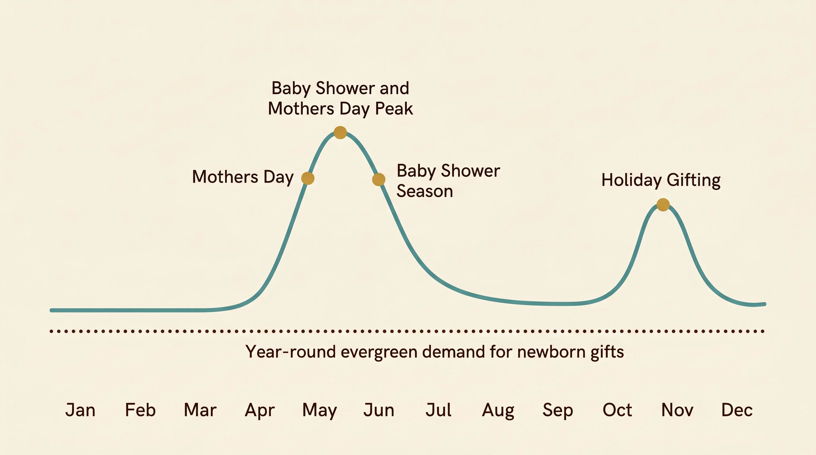
Mother's Day is ten days away. Baby shower season runs from now through July. If you're a seller looking at the calendar and thinking I should list a baby gift product, you're already late.
This listing didn't go live in April. It went live in January, when nobody was searching for baby shower gifts, when the category was quiet, when there was no obvious reason to be there. That's the move. By the time peak demand actually arrived, this listing already had three months of slow accumulating signal. A handful of sales, a few reviews, a Bestseller badge ticking over, the algorithm starting to trust it. So when the search volume tripled in April, Etsy didn't have to guess who to show. It already knew.
Sellers who list in May to chase Mother's Day are competing against listings that spent the winter quietly building velocity. The runway is the lever, not the season. You can't catch a wave you weren't already paddling for.
Baby gifts also aren't a pure seasonal play. They have a strong year-round floor, which means the runway investment isn't lost if you miss the peak window. You're building an asset that earns through July, then again through holiday gifting in November, then again through next spring. That changes the calculus on what "early" even means.
One word did the heavy lifting
The product is a personalized minky baby blanket. That category alone is a bloodbath. Etsy's click query data shows competitor brand names appearing inside buyer searches, which is what saturation looks like when the algorithm has nothing left to differentiate on except brand familiarity.
So the seller didn't compete in that category. They competed one layer deeper. The differentiator isn't personalized baby blanket, it's wildflower personalized baby blanket. That single word change moves the listing out of the saturated pond and into a much smaller one where almost nobody is fishing. The "Wildflowers Blanket" tag is virtually owned by this listing on every quality dimension Etsy's algorithm tracks, even though it pulls a fraction of the search volume of the generic terms.
Look at the title and you can see the engineering. Wildflower Baby Blanket, Custom Baby Name Blanket, Newborn Girl Nursery Decor, Newborn Swaddle, Girls Blanket, Floral Blanket. Seventeen keywords stitched together so the same listing surfaces for swaddle, nursery decor, floral blanket, and baby shower gift without the seller having to launch four separate listings. The aesthetic is what carries them all. It sits at the intersection of cottagecore, baby, and personalized — three trends that already have buyers, just not many products that combine them this cleanly.
The click query data confirms how wide the net actually is. Buyers searching terracotta nursery blanket, sage baby girl gifts, and lavender shower gift are all landing on a wildflower blanket. The algorithm is reading wildflowers as a flexible neutral that fits inside other color-driven nursery aesthetics. That's a free lift you don't get if you pick a color. Pick a botanical, and Etsy treats your listing as adjacent to half the nursery palette on Pinterest.
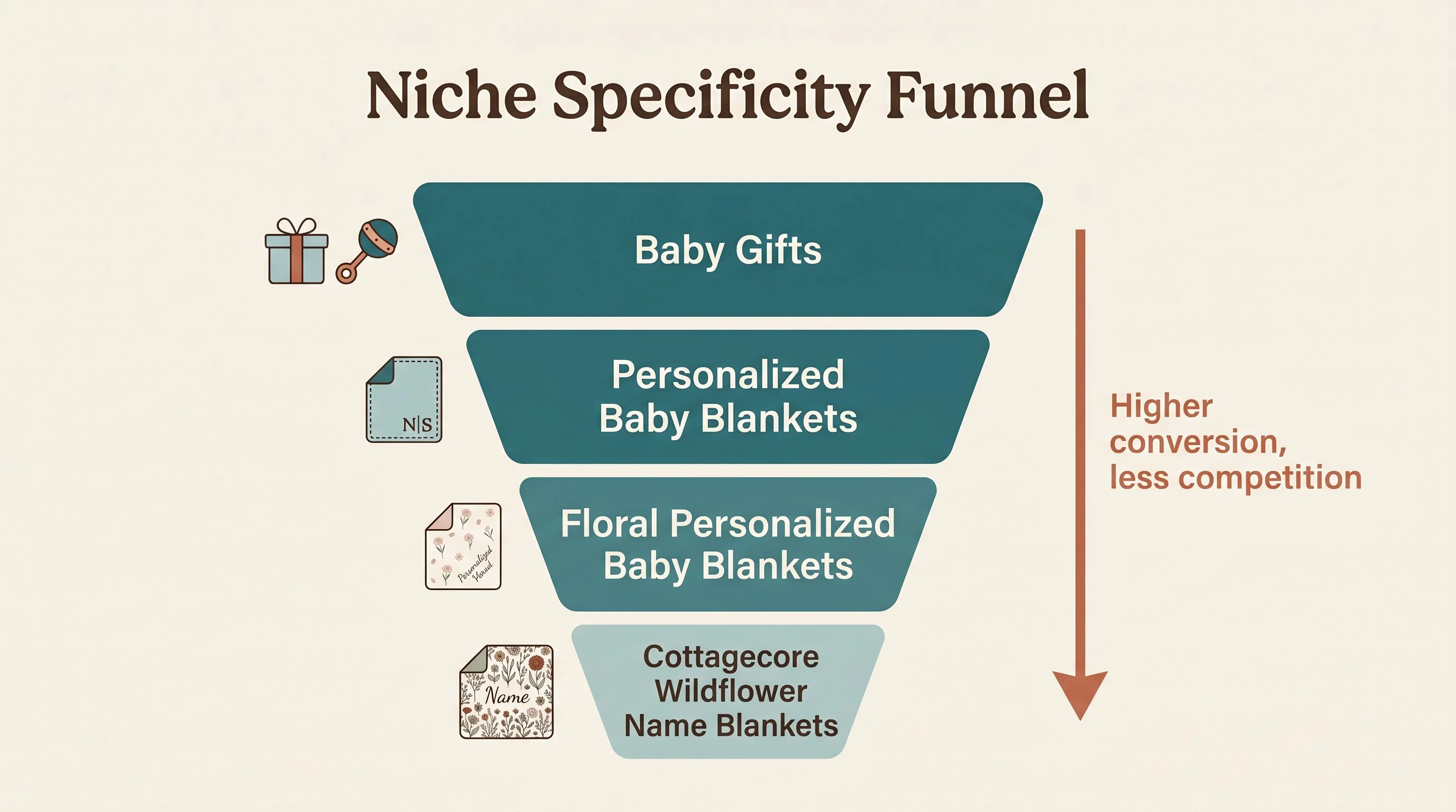
One word turned a saturated category into a category of one. That's not luck, that's the entire game played in a single line of the title.
Ten images, two jobs
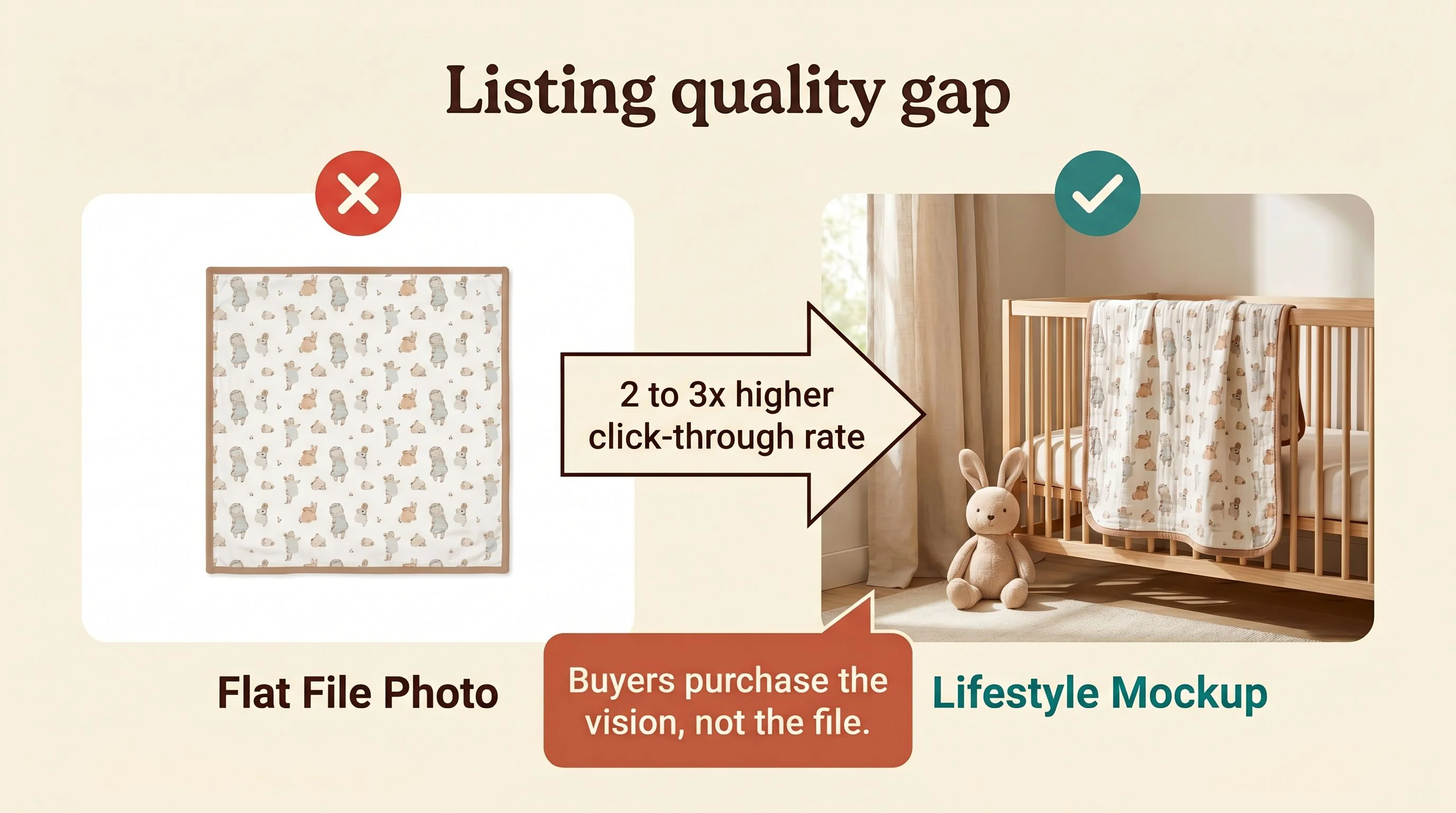
There are ten listing images. That's a lot of work for a single product, and it's the right amount.
The mix matters. Lifestyle hero shots of a baby wrapped in the blanket in soft natural light, flat lays that show the wildflower print with a real name in pretty script, side-by-side size comparisons so the buyer doesn't have to guess between 30×40 and 50×60, and a close-up of the minky fabric so the texture sells itself before the buyer reads a single review. Three print options photographed cleanly so the configurator decision feels obvious instead of risky.
For a personalized product where mistakes are non-returnable, image strategy isn't decoration. It's de-risking. The buyer is paying $20 for something with their friend's baby's name on it, and if they can't picture exactly what's going to arrive, they bounce. Every image in this listing answers a different version of will this actually look right. That's the conversion lever, and it's why the favorites are sitting near a thousand on a listing that's been live for sixteen weeks. The product itself is photogenic in a way that generic name blankets aren't, which makes the favorites compound on Pinterest in a way pure typography blankets never will.
How the badges stack
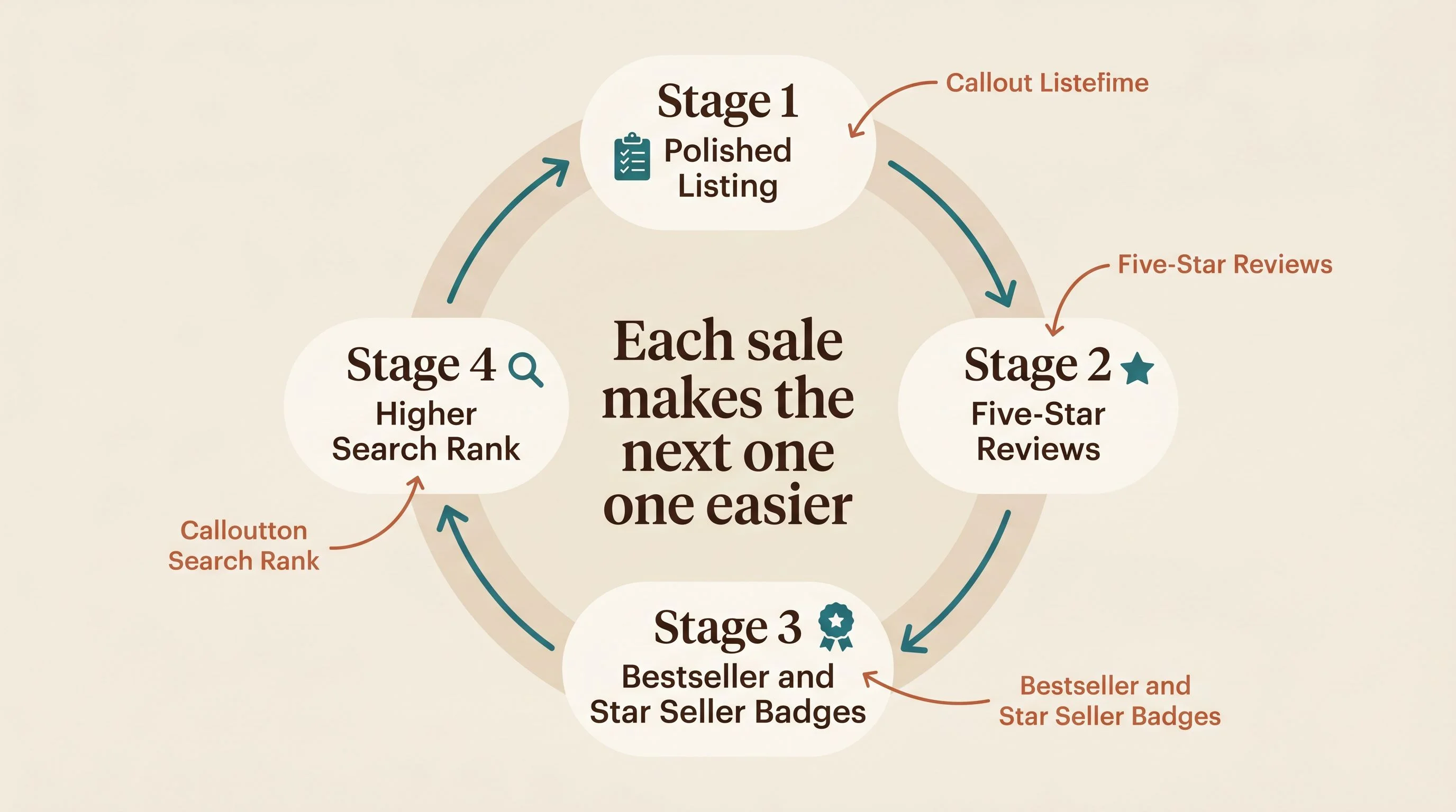
Here's where most listings stall and this one didn't. Made-to-order in California, one to five business day processing, free replacements for damage or errors, transparent FAQ, and a Star Seller badge that signals smooth shipping. None of that is glamorous. All of it shows up in the reviews.
The reviews are all five stars across the board, and the words that keep recurring are soft, beautiful, love it, fast shipping, and as described. That's the signal Etsy is reading. It's not just the rating, it's the ratio of comfort and quality and appearance comments to value comments. Buyers aren't talking about the discount, they're talking about the product. When that ratio is healthy, Etsy treats the listing as low-risk to surface to new buyers, which feeds back into more sales, which feeds back into more reviews.
Then the badges stack. Bestseller for sales volume in the last six months. Star Seller for service consistency. Live counters showing seventeen sold in the last 24 hours and four sitting in carts right now. Each one of those is a small pressure on the next visitor's decision, and together they compound into the thing the trend graph is showing. A 193% month-over-month lift isn't luck. It's the algorithm reading every signal as positive and turning up the volume.
This is what people mean when they talk about velocity. Each sale doesn't just generate revenue, it makes the next sale slightly easier to land. A four-month-old listing with five hundred sales is now competing for impressions on completely different terms than a fresh listing with twelve sales, even if the products are identical.
One honest note before we move on. LoveSuna isn't a fresh shop. It's six years old with millions in lifetime sales, and a new listing inside an established account gets a velocity advantage a brand new shop can't replicate. That's real. But the specific listing is four months old, and the design choices, the aesthetic, the tag architecture, the mockup strategy — those are all reproducible. Reputation capital makes a good listing climb faster. It doesn't make a bad listing work.
Where the next wildflower is hiding
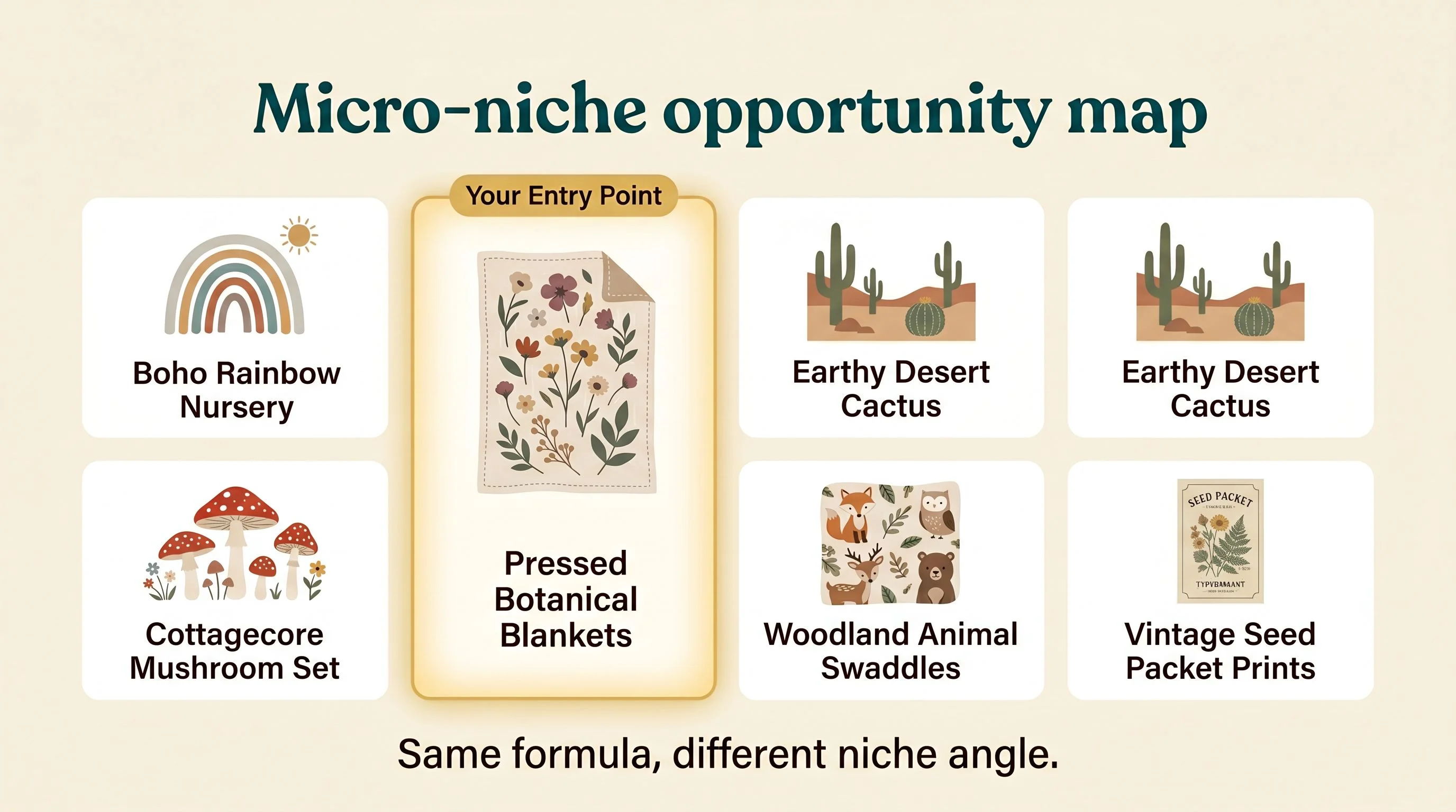
Wildflowers is the moat for this seller. It's not the only moat available.
The transferable insight is that aesthetic + personalized baby product is an open category, and "wildflower" is one of probably twenty viable aesthetic anchors. Boho rainbow. Vintage botanical. Pressed-flower watercolor. Cottagecore mushroom. Earthy desert. Soft animal vignettes like woodland fox and forest bunny. Each one of those is its own micro-niche with its own search behavior, its own Pinterest audience, and its own thin-to-empty competitive shelf.
The product format is also flexible. Minky blanket is the high-AOV anchor here, but the same aesthetic system runs across swaddles, muslin blankets, name banners for the nursery wall, milestone cards, and birth announcement prints. Pick one aesthetic, design a small cohesive system across three or four product types, and you've built the same kind of shop architecture LoveSuna is running. They don't have one wildflower blanket, they have variations on the same template hitting different search intents.
If you're entering, the cleanest opening isn't another wildflower blanket. It's an adjacent aesthetic with the same structure. Pressed botanical name blankets in a single color story. Sage and terracotta nursery announcements. Vintage seed-packet birth prints. Pick the lane, build the cohesive set, and let specificity do the heavy lifting on competition.
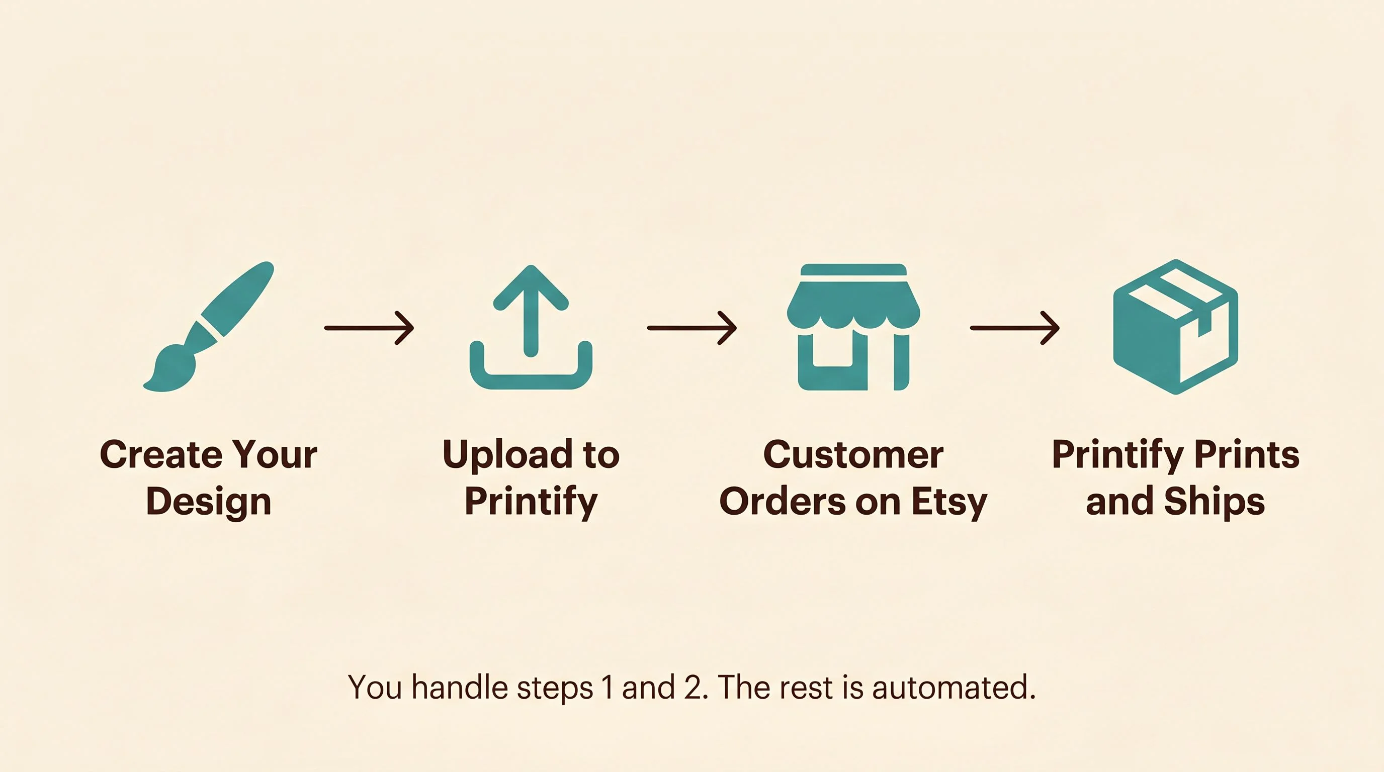
You never touch a blanket
Made-to-order minky blankets sound intimidating until you realize Printify and Printful both fulfill personalized baby blankets directly. You design the artwork once, upload the print file, set up the personalization variables in Etsy, and the print partner handles the rest. You never touch fabric. You never ship a blanket. The customer orders, your fulfillment partner prints and ships, you keep the margin.
Keep the margin. Build the catalog. Here's how many listings your income goal actually requires.
That makes the actual work the design and the listing, not the production. AI image generation handles most of the wildflower artwork now if you direct it well. Mockup generation tools turn your flat artwork into the lifestyle nursery shots that move the conversion needle. The listing copy and the tag architecture are the part that takes real thinking, and it's the part that compounds.
You handle steps one and two. The rest is automated. That's the whole game.
The hard part isn't the labour. It's knowing which products buyers are already searching for, which aesthetic anchor holds up year-round instead of fading after one season, how to write the title and tag architecture that makes Etsy do the heavy lifting, and how to wire one good listing into a catalog that compounds. That's the entire premise of the next system.
You don't need a six-year-old shop or a million dollars in reputation capital to start. You need one specific aesthetic, one cohesive product system, and the patience to list it before the season everyone else is chasing. Pick the niche. Build the set. Let the flywheel do the rest.
— Nick, Second Stream Journal