
All over the country right now, people are paying good money to hang paintings of flip flops in their laundry rooms. Not beach scenes. Not sunsets over the water. A pair of flip flops, a beach bag, a set of sunglasses, painted in navy watercolor and framed above the washing machine.
One of these listings wears a Bestseller badge, holds close to a thousand favorites, and sits in twenty-some carts on any given afternoon. Prints start around twenty-six dollars. And the shop behind it, PolychromePages, isn't some decor brand with a warehouse. It's a small coastal shop where this one navy set quietly does most of the heavy lifting.
If that sounds like a strange thing for the market to reward, good. Sit with the strangeness for a minute, because inside it is almost everything worth knowing about how decor niches actually work, and where the door is still wide open for you.
The product is a feeling, not a painting
Nobody needs a picture of flip flops. What the buyer wants is the way June feels, hung in the most ordinary room of her house. The laundry room, the guest bathroom, the hallway by the back door. Small objects carry that feeling better than any beach panorama, because objects are personal. Everyone has owned the sandals. Everyone has carried the bag.
That's the real niche here, and it's why the search behavior around this listing sprawls the way it does. Buyers arrive shopping for an object, flip flop wall art. They arrive shopping for a color, navy, teal, shades of blue. They arrive shopping for a room, bathroom art, laundry decor, pool house. Different people, different words, all reaching for the same feeling.
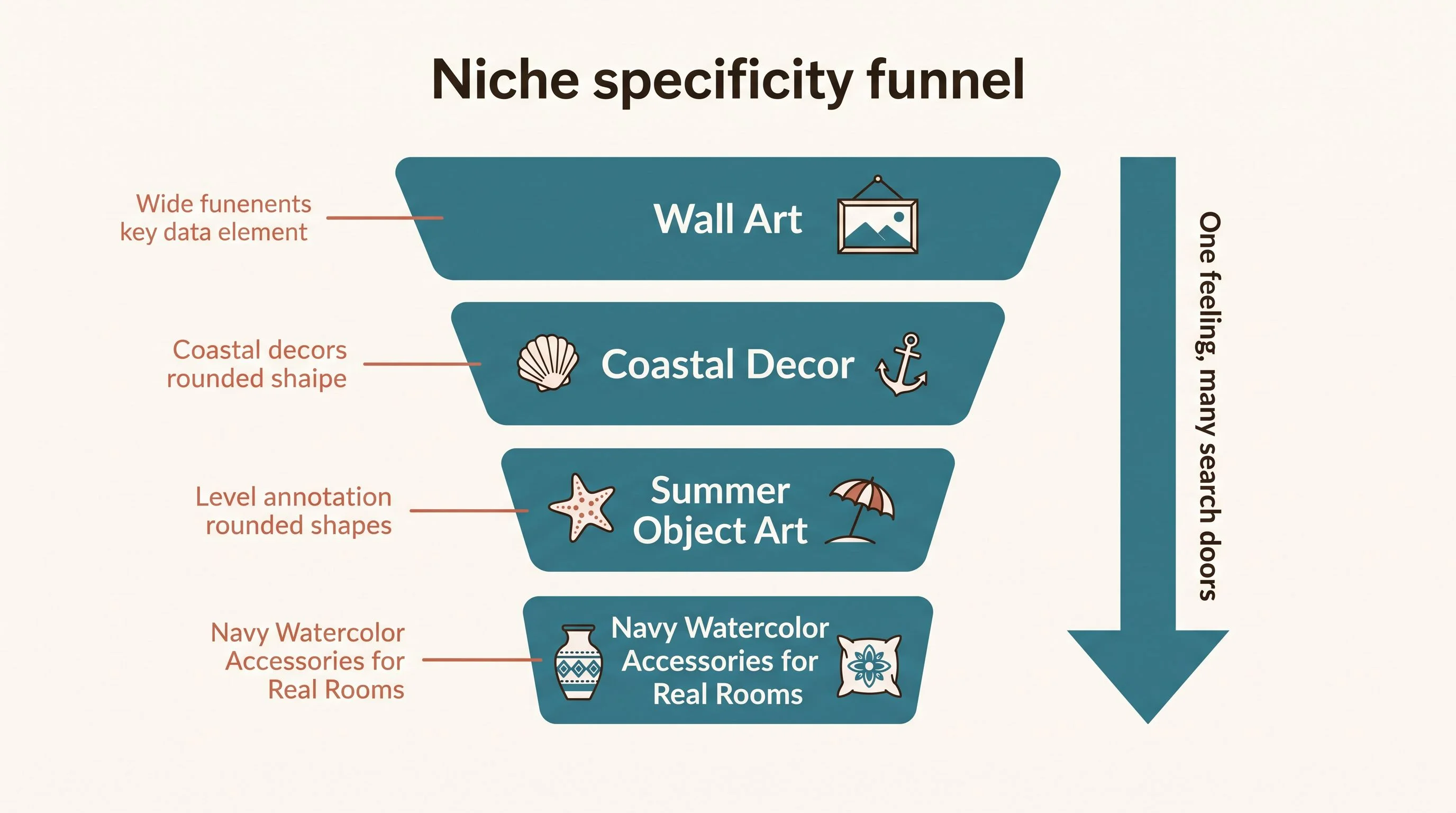
Look at how the listing title is engineered and you'll see the seller understood this. Summer Accessories, then the three objects by name, then Navy Blue, then Coastal Beachy Decor Watercolor Art, then the sizes. That's not a description. That's a net stretched across every door a buyer might walk through, and the buyer never notices the net at all.
You're looking at next summer's blueprint
Here's a secret about seasonal niches that most sellers never figure out. The listings winning this July weren't built this July. This navy set was planted seasons ago, gathered its reviews through the quiet months, and was already sitting at the top when the summer buyers arrived. The winners are always decided before the season starts.
Which means right now, mid-summer, you're holding something valuable: the complete blueprint of a proven winner, with a full run of quiet months ahead to build your own version. Coastal decor never actually sleeps, either. Lake houses and beach bathrooms don't stop existing in October, so a steady baseline of buyers keeps flowing while you stack up reviews and rank. Then spring demand surges, and this time you're the listing they keep seeing.
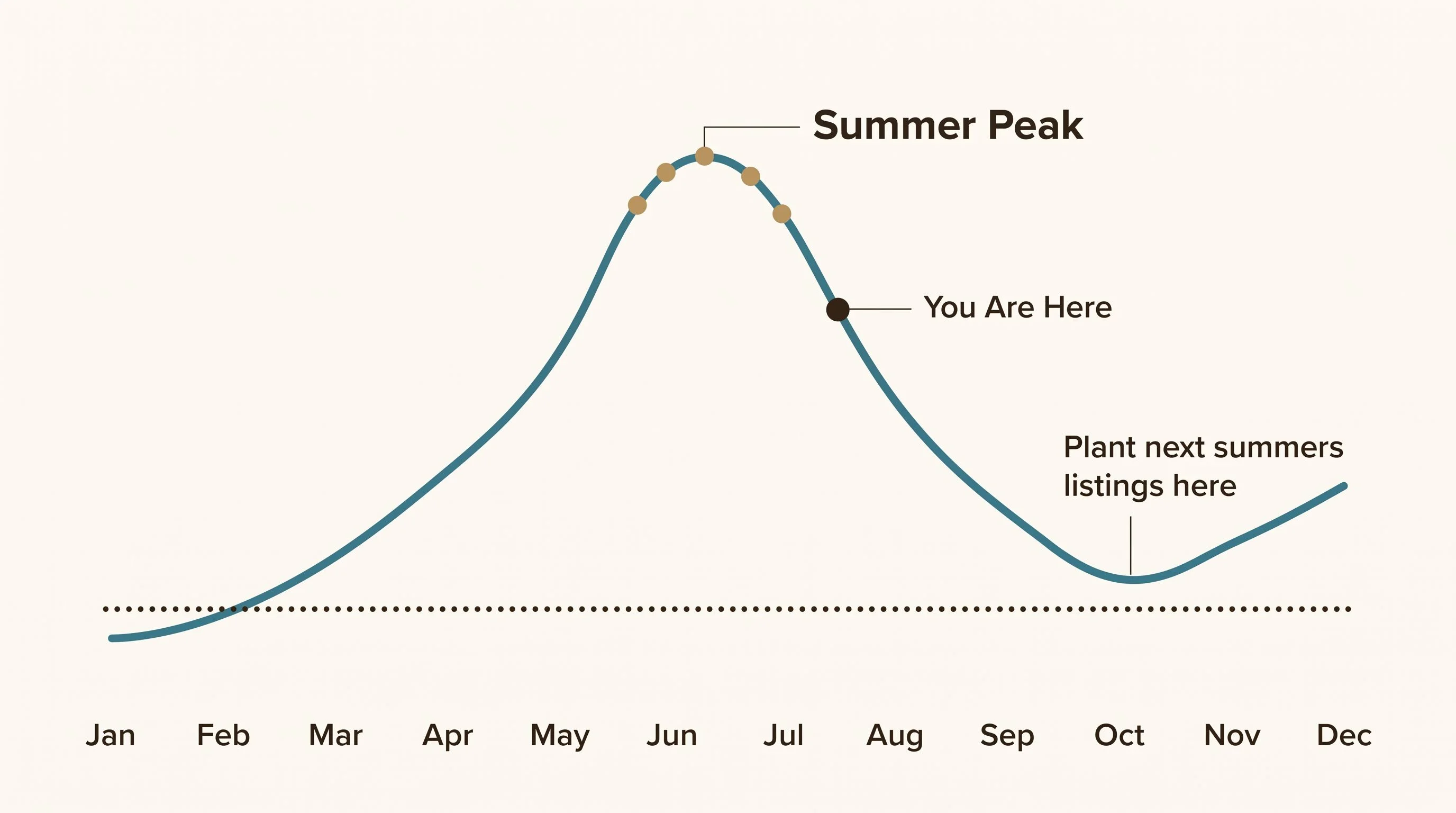
Sellers who plant in the fall, while everyone else is distracted by pumpkins, get months of runway that can't be bought later at any price. That head start is sitting on the table right now, and almost nobody takes it.
In decor niches, the mockup is the product
Ten photos on this listing, and nearly all of them are rooms. The prints hang over a laundry counter, in a bright bathroom, in a styled coastal hallway. The artwork itself almost never appears alone on a white square, and that's not an accident.
A buyer can't hold the paper before she pays. The only thing she can experience is the photograph, so the photograph has to be the moment after purchase: her wall, already wearing it. One reviewer wrote that the print looks great in her laundry room, which is precisely the room the photos staged for her. The listing showed her a corner of her own future house, and she bought it.
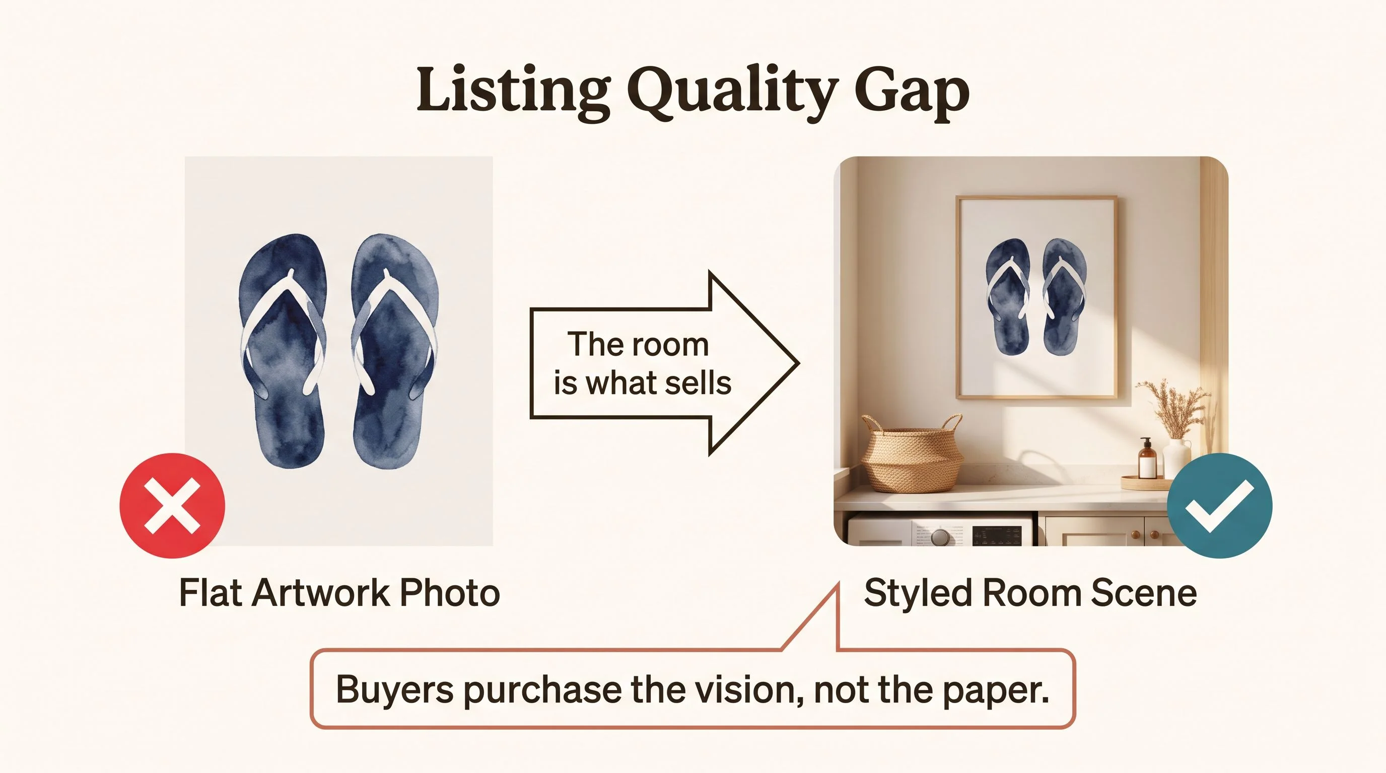
If you take one practical thing from this whole teardown, take this. Your design skill matters less than your staging skill. A decent painting in a beautiful room outsells a beautiful painting on a white background, every single time.
The product was never a painting of flip flops. It's the feeling of summer, distilled into objects small enough to hang in the most ordinary room of the house.
The quiet mechanics underneath
The unglamorous details are doing more work than they appear to. Eleven print sizes, so every wall and budget is covered. Each object sold alone or as a set of three, so the same listing serves a twenty-six dollar impulse and a gallery wall. A small buy-together discount that turns one print into two. Made-to-order through a print partner, so no inventory ever piles up in a spare room.
None of those choices is clever on its own. Stacked together, they remove every reason to hesitate, and the reviews show it: five stars across the board, buyers praising the paper, the packaging, the speed.
And that's where the compounding starts. Clean reviews earn badges, badges lift search rank, better rank brings the next buyers, who leave the next reviews. The loop is why one navy set can end up carrying a whole shop.
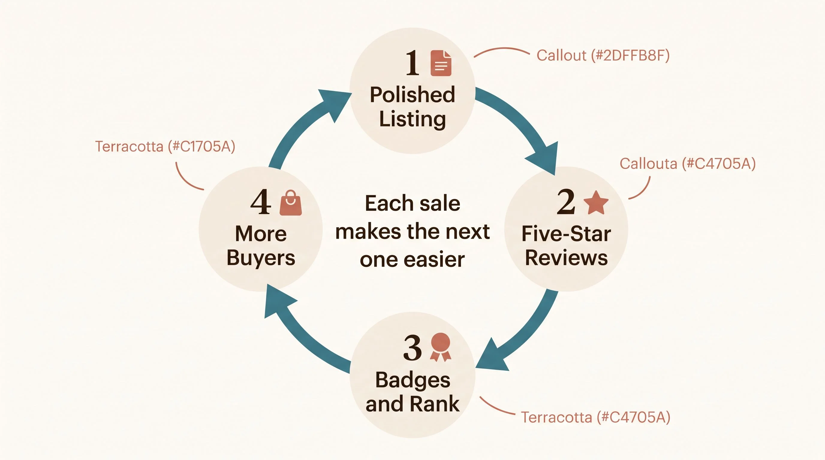
Here's the part that should make you sit up. The loop doesn't know whose shop it's turning for. It rewarded this seller because the pieces were in place, and it will do exactly the same for yours.
The doors this niche left open
The search data around this listing reads like a list of unanswered requests. People typed Carolina, Malibu, and Orange Beach into Etsy and landed on a print that names none of them. A buyer searching for her beach settled for a generic one, which means a print that actually says her beach wins that moment easily. Lake house searches pour in too, answered only halfway by navy coastal art.
The palette is another open door. This corner of the niche is saturated in blue, but plenty of homes want coastal without navy. Sage green summer objects, warm terracotta, soft sand neutrals. Same feeling, different shelf, far fewer competitors.
There's even a steady trickle of buyers searching for digital versions of art exactly like this, and landing on a paper print they have to wait a week for. If you'd rather start with downloads than deal with print partners at all, that trickle is your invitation.
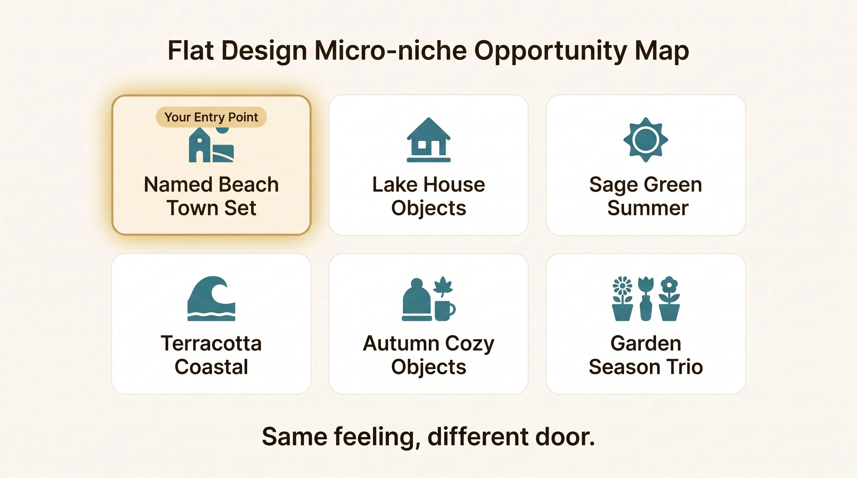
And notice that the format itself travels beyond summer entirely. Three small objects that mean a season is a formula, not a beach trick. A trowel, gloves, and a watering can for the spring gardener. A whisk, a rolling pin, and a mixing bowl for the kitchen wall. Mittens, cocoa, and skates for December. Pick the feeling, find its objects, and you've built the same product this seller built, aimed at a shelf nobody's crowding yet.
What it takes to walk through one
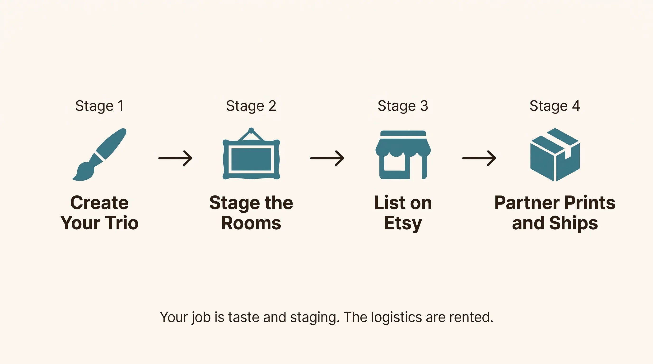
Less than you'd think. You design the trio, and today's AI art tools handle loose watercolor beautifully when you direct them with taste. You stage the mockups, which you now know is where the sale actually happens, so that's where your hours go. Then you connect a print partner like Printify to your Etsy shop, and every order is printed, packed, and shipped without you touching a box.
Your job in this business is taste and staging. The logistics are rented. That's the whole quiet secret behind a listing like this one, and there's nothing in it a careful beginner can't do.
Pick the feeling you want to bottle. Paint the three small objects that mean it. Stage them in the rooms where someone lives her ordinary days, and list them ahead of their season. Somewhere out there is a laundry room waiting for what you make.