Someone typed "cute bunny coloring page" into an AI image generator. The output was genuinely beautiful. Soft painted fur, dappled light, a meadow background filled with bluebells. They stared at it for a moment, thought that's perfect, exported it, and listed it as a coloring page.
The first customer to download it printed it out, tried to color it in, and left a three-star review. "Looks pretty but can't actually be colored — too much shading, no clear lines." The seller didn't understand what went wrong. The AI produced exactly what they asked for.
That's the problem. The AI produced exactly what they asked for.
A pretty picture and a sellable product are different things, and the gap between them is your prompt. When you ask for "cute bunny," you get art. When you ask for "a single rabbit sitting upright, bold black line art, thick consistent outlines, white fill areas, no shading, no grey, no background, coloring page style," you get a product. The AI doesn't know the difference unless you tell it. And telling it is a skill — one that takes about five minutes to learn and pays for itself on the first listing.
The brief, not the wish
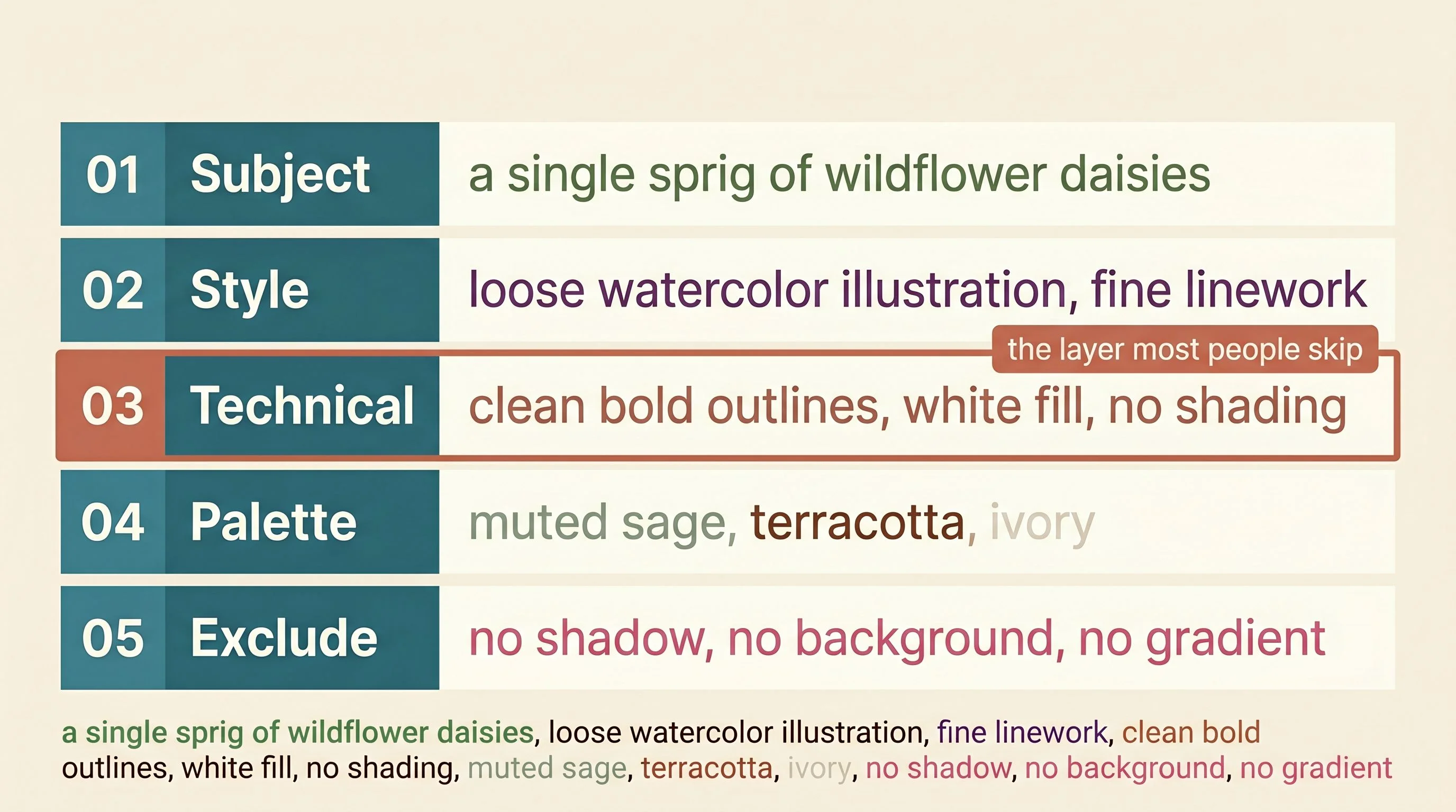
A prompt has five jobs. Most people only do one or two.
The first is the subject — what you're actually making. Specific enough to aim the model, loose enough to leave it room to work. "A single sprig of wildflower daisies" is better than "flowers." "A cozy fox in a knit scarf, facing right" is better than "cute animal." The subject controls what appears in the image. Everything else controls how it looks and whether it's actually usable.
The second is the style — artistic medium and visual genre. Not a feeling, a technique. "Watercolor illustration, soft wet washes, minimal outlines" is a style. "Bold line art, thick even strokes, flat colour fill" is a style. "Vintage botanical engraving, fine crosshatch detail" is a style. "Cute" is not a style. Neither is "pretty" or "cozy." Those are feelings, and the model will guess what you mean. Usually incorrectly, for your purposes.
The third is the technical requirement — what the output needs to do, not just what it needs to look like. This is the layer almost nobody writes, and it's the most important one. For a coloring book page, the technical requirement is: clean bold black outlines, no shading, no fill colour, no grey areas, white space for colouring. For a seamless pattern: tileable repeat, no single dominant composition, flat illustration, evenly scattered elements. For a sticker: isolated subject, white background, no shadow, no background elements. For wall art: archival print quality, vertical portrait ratio, no text. Every product type has a different specification. Writing the right one is the difference between output you can sell and output you have to throw away.
The fourth is the palette — colour temperature, saturation, named tones. Not "warm" but "muted sage, terracotta, and cream." Not "pastel" but "soft powder pink and ivory with lavender accents." Palette is how you build a shop that looks like a collection instead of a grab-bag. Every sticker set, every pattern family, every art print series should have a colour story baked into the prompt so the outputs feel like they belong together.
The fifth is the exclusion list — what you tell the model not to include. This layer gets skipped constantly, and it shows. "No background, no shadow, no gradient, no extra elements, no text" turns a chaotic output into a clean, usable file. Without it, you spend 20 minutes in Canva removing the atmospheric forest floor your sticker bunny is sitting on because you forgot to say it shouldn't be there.
One brief. Five layers. The sellers who skip layers three through five wonder why their output looks great and won't actually sell.
Where product type changes everything
The same wildflower daisy can be a coloring book page, a seamless repeat pattern, a digital sticker, and a printable wall art print. Different buyers. Different uses. Completely different technical requirements — even though the subject is identical. The technical layer is what changes.
For a coloring book, that layer is: clean bold black outlines, thick consistent line weight, white fill areas, no shading, no colour, coloring page style. The moment you leave this out, the model generates a painted illustration. Beautiful, unusable. Desaturating it later doesn't fix the problem — you get grey muddy fill, not empty white areas a child can color in. The model has to know it's making a coloring page from the beginning, or it makes art.
For a seamless pattern, the layer is: tileable surface repeat, seamless edges, flat illustration, evenly distributed elements, no single centred composition. "Seamless" alone is not enough. Without the structural spec, the model generates a gorgeous single illustration that tiles into a visible stamp effect — your daisy, then a gap, then your daisy again. "Ditsy surface repeat, scattered evenly, no dominant central element" tells the model the geometry. That's what makes it a pattern instead of a picture.
For a digital sticker, the layer is: single isolated subject, white background, no shadow, no background elements, die-cut sticker style. That phrase — "die-cut sticker style" — does more work than it looks like. It frames the request in a way most models understand as "subject only, no context, clean silhouette." Without it, your daisy is sitting in a field, and now you're spending ten minutes removing the field.
For printable wall art, the layer is: archival print quality, vertical portrait ratio, fine art illustration style, no text. And critically: the aspect ratio. A daisy generated as a 1:1 square is wrong for a 5×7 print. Specify the ratio in the prompt — "vertical 4:5 portrait composition" — and you get an output that fits your print dimensions without awkward cropping.
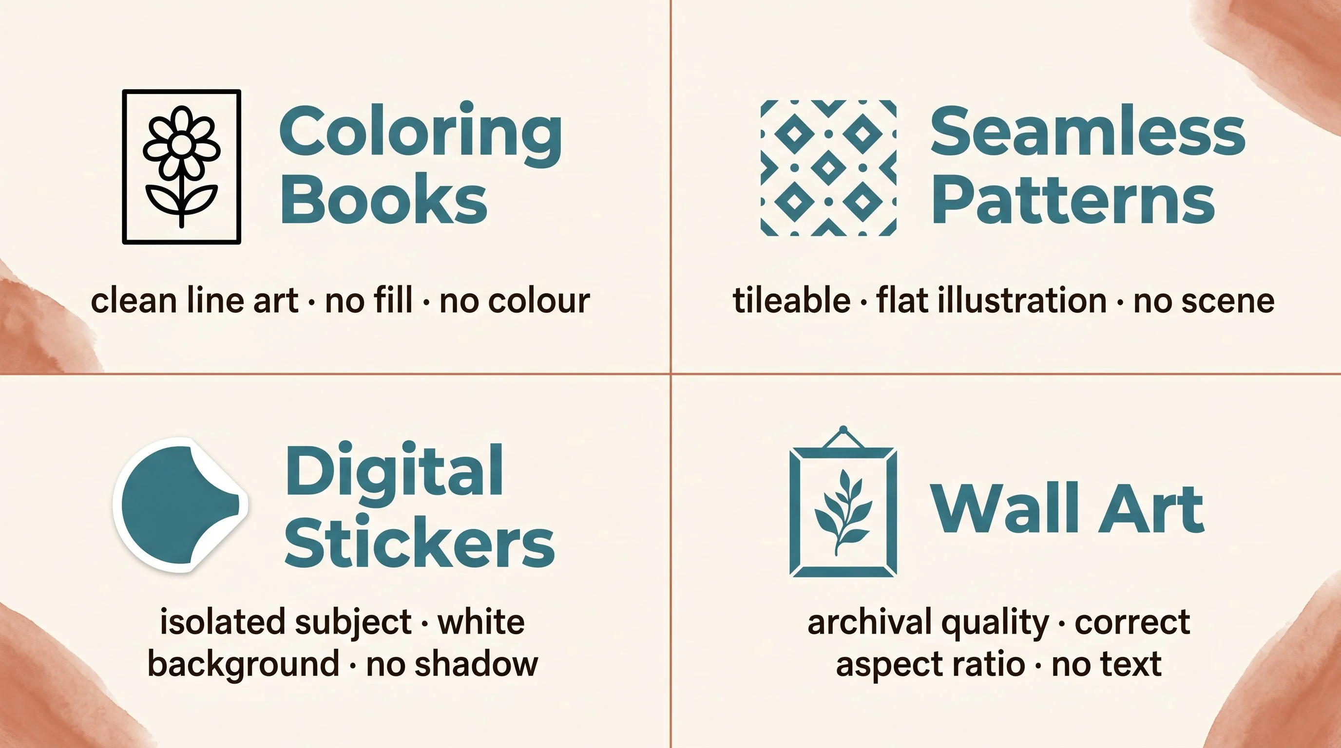
The subject is your creative decision. The technical layer is your product specification. One changes with every listing. The other is nearly fixed by the product type you're in.
The test before the listing
The AI gives you output. It does not give you quality control. Those are two different things, and assuming the first includes the second is how you end up with a coloring book where the lines fall apart at full print size, or a pattern with a seam running straight through the middle, or a sticker set with a faint grey halo around every shape that the buyer can see against their planner background.
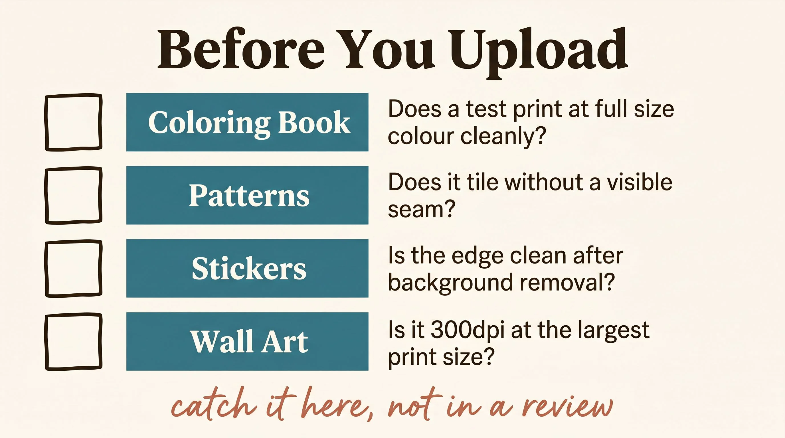
There are four checks. They take less than five minutes combined. They catch the problems before the buyer does.
For coloring books: print a test page at the actual finished size. Can you color cleanly between the lines? Are the lines still crisp at 100% at 8.5×11? If the image looks great on screen but the lines are fuzzy at full print resolution, the output isn't there. A one-star review about a blurry download is always a resolution problem that should have been caught here.
For patterns: tile four copies manually in Canva before you list anything. Drag them into a 2×2 grid and look at the seams. The edges should connect without visible breaks, colour shifts, or awkward element repetition at the join. Most AI-generated "seamless" patterns have at least one seam problem. Catch it at the tile test, not in a buyer complaint.
For stickers: run the output through remove.bg and zoom into the edges at 200%. The boundary between your subject and the transparent background should be clean — not blurry, not fringed. A halo or uneven edge around the sticker looks amateurish in a category where buyers compare packs side by side before they buy. Clean edges are not optional.
For wall art: check the resolution at the actual largest offered print size. The floor is 300dpi at full dimensions. A file that looks sharp on screen but fails at 8×10 is worthless to the buyer who downloads it and tries to print it at home. Every resolution-complaint review was a file that passed the screen test and failed the print test.
Build the library, not just the listing
The sellers building real catalogs from AI aren't re-inventing prompts for every listing. They're running a prompt library — a small set of tested formulas organised by product type and aesthetic family. The subject changes. The rest of the prompt is nearly fixed.
Think of it in three layers. The technical spec stays constant for a product type — you write it once, test it, confirm it works, and never change it. The style and palette stay constant within a collection — every sticker in your autumn café series shares the same line weight, the same colour story, the same illustration style. The subject variable is the only thing that changes between listings.
That structure is how a shop with 30 listings looks cohesive. It's also how you make 30 listings in the time most people spend making five. The decision-making is front-loaded. Once the formula is proven, execution is fast.
The craft here isn't in the AI generation. It's in the formula. Working out which style vocabulary produces clean line art every time for your coloring books, which palette string keeps your pattern collection feeling unified, which exclusion list stops your sticker generator from placing every subject in an atmospheric environment. That work happens once and then compounds across everything you make after it.
The wish gets you a pretty picture. The brief gets you a product. You're five parts away from knowing the difference.
— Nick, Second Stream Journal